Notifications
Contents
Introduction
Notifications are the primary way for an application that isn’t running in the foreground to indicate it has information for the user. Notifications may be sent by unfocused, running applications or applications that have been allowed to check for new information in the background when not running.
Designers
WilliamJonMcCann, AllanDay, JakubSteiner
Objectives
Primary
- Separate content and presentation of notifications
- Support both banner (non-modal/peripheral) or modal (pre-empting/interactive) notification modes
- Do not require a persistent connection to present notifications (ie robust against application crashes)
- Allow background applications to inform users
- Allow non-running applications to inform users
- Allow cloud services to inform users
- Allow service subsystems to alert users
- Allow service subsystems to alert users on behalf of an application
- Allow an application launched or brought to the foreground to direct the user to the relevant information
- (possibly) notification payload to be delivered to handling application
- Allow applications to present contextual actions for the notification
- Support user modification of notification policy (putting the user in control of what may interrupt them)
- Allow applications to cancel or recall (one or all) notifications
- Support for the following information for all notifications:
- Application icon
- Application name
- Allow the user to:
- prevent display of an application's notifications
- specify whether an application's notifications may appear on a locked screen
- specify if an application should present banner or modal type notifications
Secondary
- Support for future event delivery
- Support sound events for notifications
- Support for resident notifications that remain stored after use
- Support for notifications that are transient and never stored
- Support for supplementary image data (example, cover art)
Non-Goals
- Support for positioning notifications
- Support for expiring notifications
- Support for notification categories
- Support for application specified urgency
- Support client/server capabilities negotiation
Open Questions
- Support for text markup?
Tentative Design
Notification Properties
Icon |
A symbolic icon or application icon (falls back to the latter if the former isn't provided). |
Title |
The heading for the notification. |
Body |
An optional block of text which gives extra detail about the notification. Can include multiple paragraphs. Eg. A snippet from the beginning of an email. |
Default Action |
The action that is triggered when the notification is activated. This should always switch to the notification source (typically an application). |
Actions |
The notification sender can include up to three action buttons. |
Priority |
This can either be NORMAL or URGENT. NORMAL is the default. |
See: https://developer.gnome.org/gio/stable/gio-GNotification.html
Notification Queue
- If notifications arrive while a banner is being displayed, they are queued and displayed in sequence.
- When the queue contains three notifications, new notifications cannot be added to the queue. Instead, they are displayed in the notifications list, and a small visual cue (this is a dot in the mockups) indicates that there are more notifications ready in the list.
- Notifications are added to the notification list (found in the date and time drop down) as soon as they are in the queue - the list should include all received notifications that have not been dismissed, not just those that have been displayed as banners.
- Each application is only permitted to have its three most recent notifications in the queue/notifications list. Once they have reached the three notification limit, their oldest notifications are discarded when new ones arrive.
Notification Types
Notification types include urgent notifications and special, private, notification types that are only available to the core system or privileged core applicaitons.
Urgent
Urgent banners are displayed in expanded mode by default. They are the only banners to be displayed over fullscreen windows.
When the calendar drop-down is open, and an urgent notification arrives: forcibly close the calendar drop-down and show the notification banner.
Transient
When a notification is transient, only a banner is displayed, and the notification isn't displayed in the Message Tray/notification list.
For this redesign, it would be good to try and remove the concept of transtient notifications, both because of problems associated with them (eg. what to do when a transient notification is due to be displayed and the message list is open), and in order to reduce design and implementation complexity.
Instead of using transient notifications, the notification sender can automatically remove the notification after a short time period.
Chat
In expanded mode, Chat banners can grow larger than other notifications, and are the only banners to include a reply box.
Hot Plug
If "ask what to do" is set for media that is inserted, an urgent notification is shown:
- Default action is to open the media in Files [not the best, but what else can we do?]
- Actions can list up to three additional applications that can be used to open the media. Unlike other notification buttons, these include an icon and text.
Banners
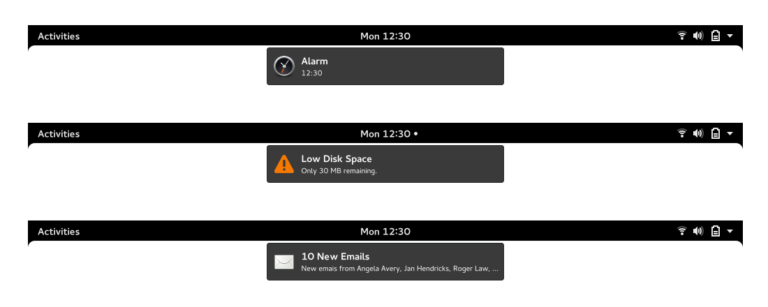
- Each banner includes an icon, heading and (if included) one line of body text.
- Banner is displayed for a predefined period of time before disappearing. This count down does not begin while the user is idle.
- Clicking or pressing a banner performs the default action (this typically dismisses the notification and opens the notification source).
- Banners are not displayed when the time and date drop down is open.
Expanded Banners
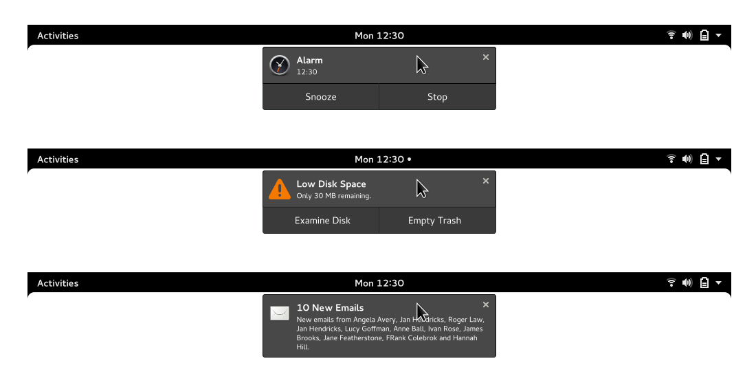
- Hovering a banner with the pointer, or tapping it on touch, expands it.
- Each part of the message banner has a hover state, to indicate that it is clickable.
- When expanded, up to six (?) lines of body text are shown, along with any notification actions.
Time and Date Drop-Down
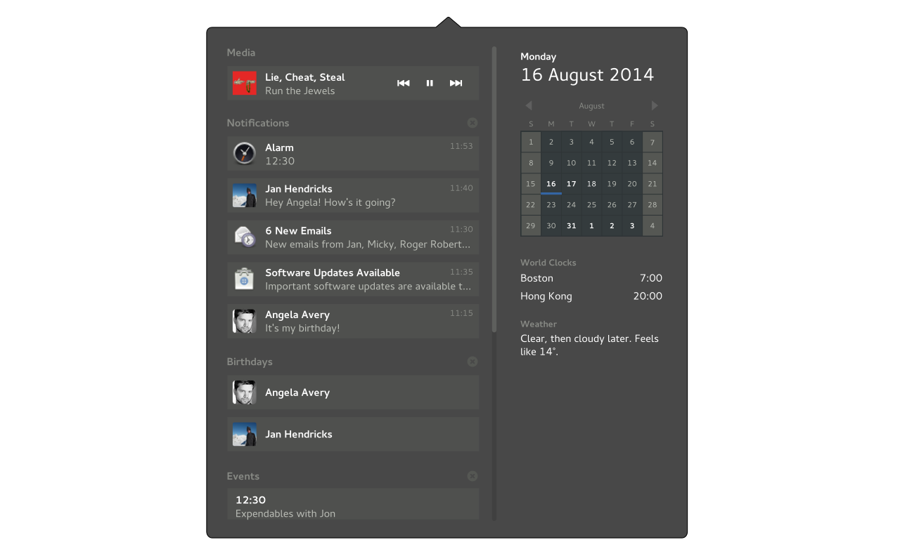
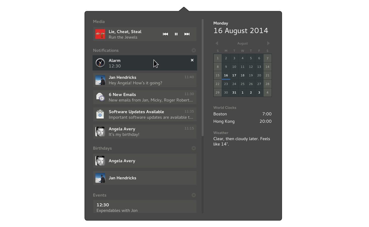
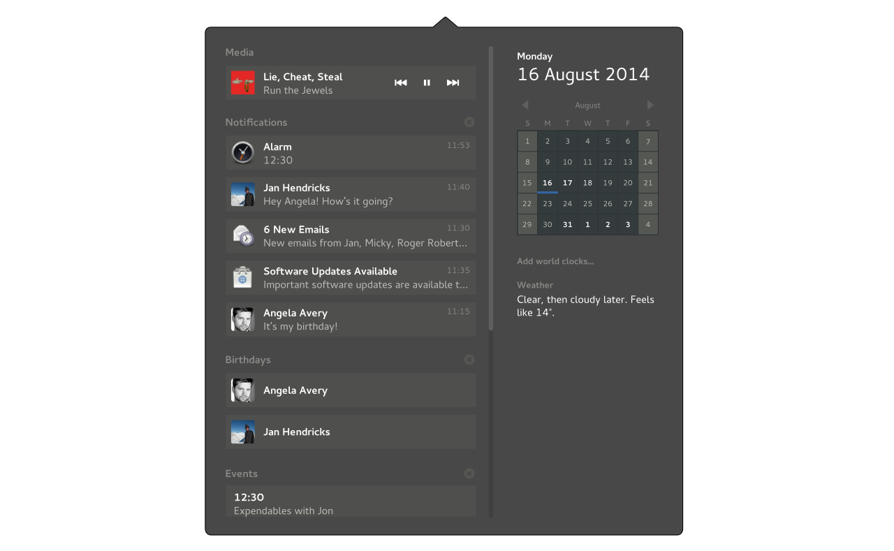
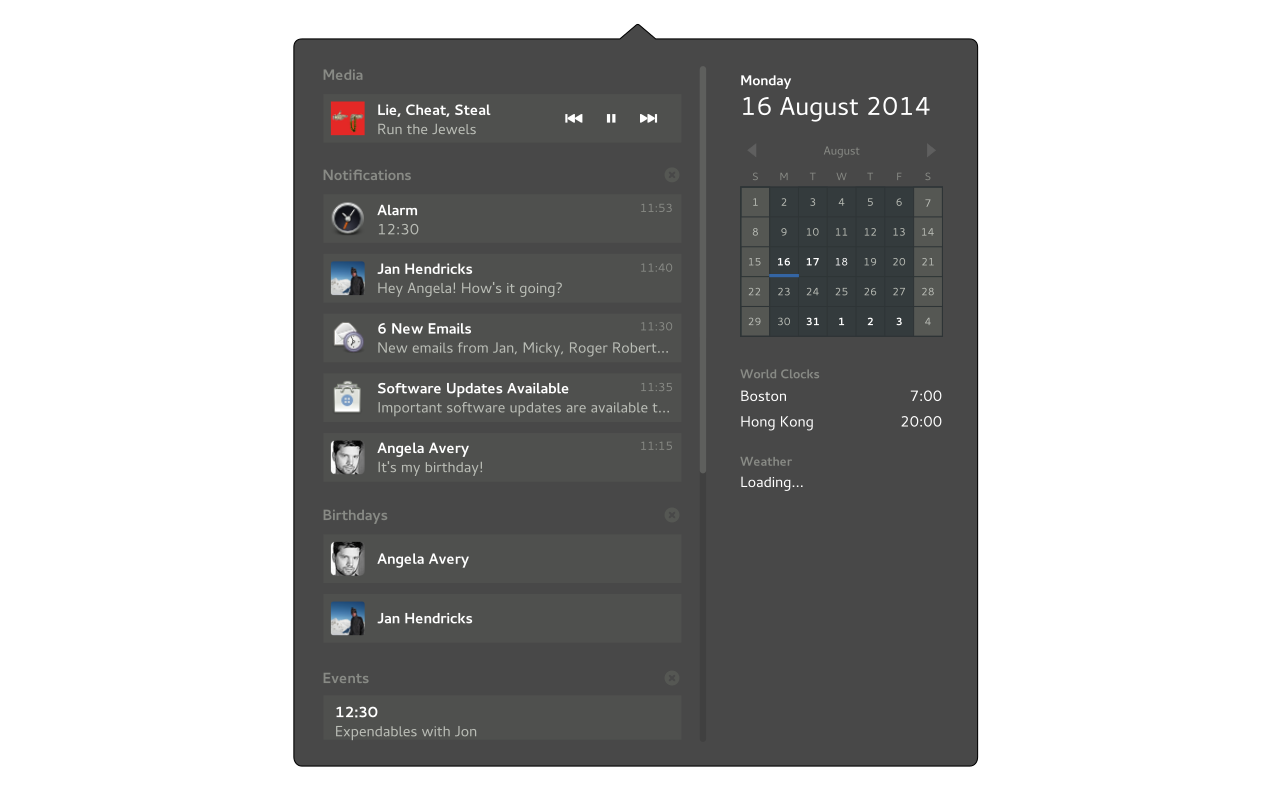
The time and date drop-down is split into two main sections. The left side includes transient notifications and reminders, which is structured as a list of messages. The right side contains permanent UI elements which show constantly updated information (such as the weather or time zones).
Drop-Down Height
- The height of the time and date drop-down is determined by the height of the content in the right and left panes. As items are added/removed, the height of the popover adjusts.
- If the number of items in the left pane exceeds the height of the screen, the list scrolls.
- When browsing events (see below) the height of the popover is fixed to its previous position. This prevents frequent height changes while browsing.
Active Areas
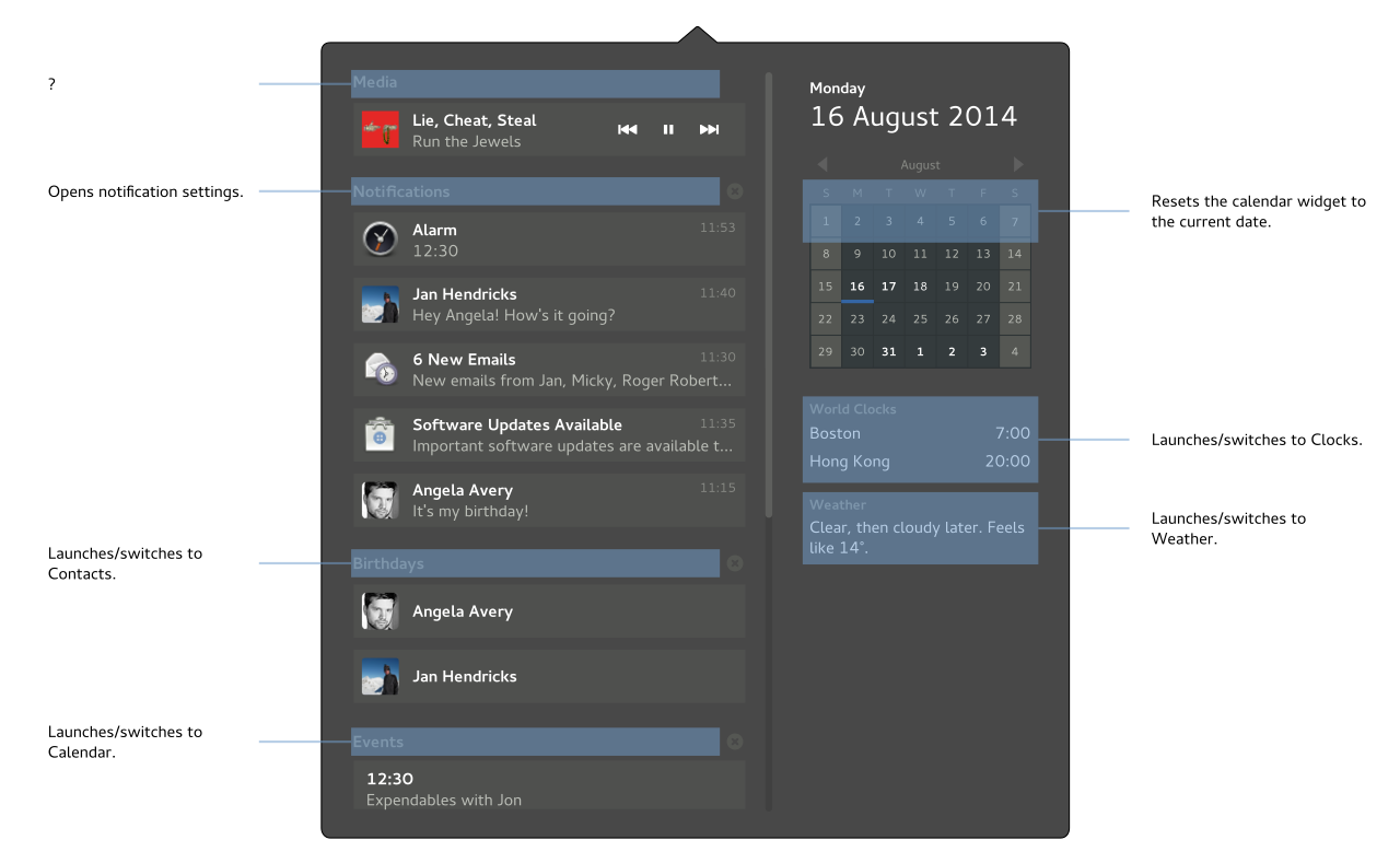
Areas highlighted in blue react on hover, and have actions associated with them.
Message List
Contains three sections:
- Notifications
- Listed in date/time order.
- Dismiss button is displayed on pointer hover.
- Clicking/pressing a notification performs the default action.
- Birthdays for today
- Events
- Shows a list of events for today
Each section can be cleared as a whole, using its clear button.
Empty State
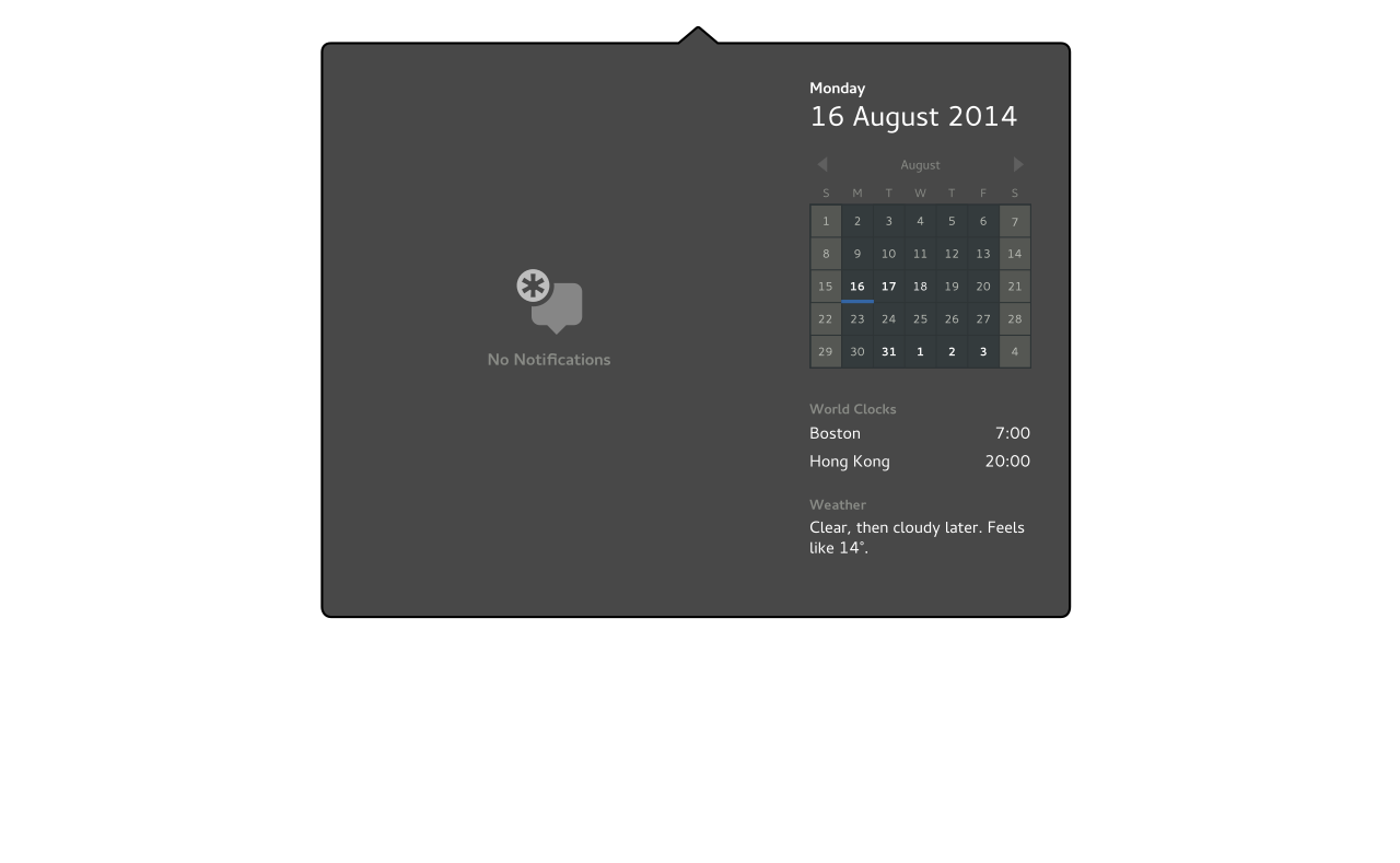
Sections for Notifications, Birthdays and Events are not shown when empty. When the left pane is completely empty, a placeholder is displayed.
Calendar Browsing
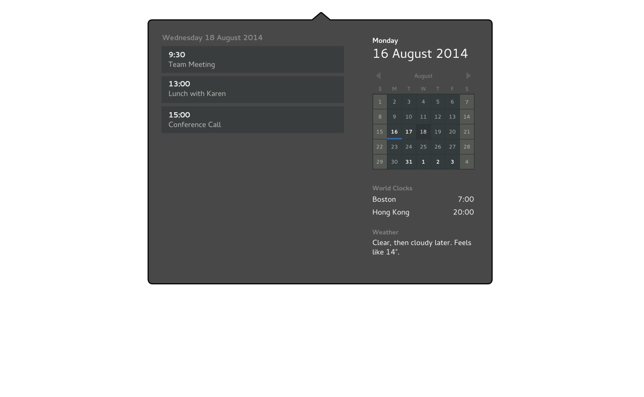
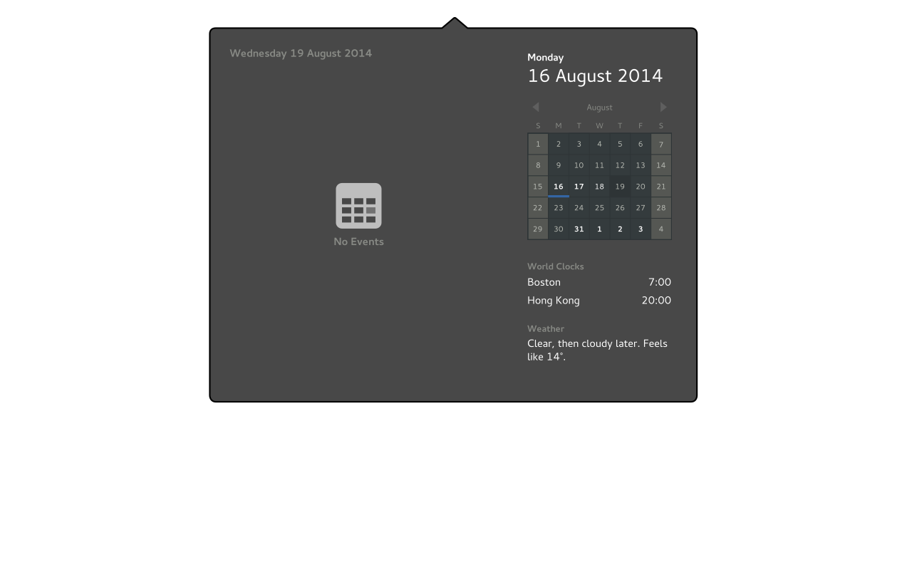
When a date is selected from the calendar widget, events for that day are displayed in the list on the left.
Selecting the current date returns to the main view.
World Clocks
Lists the time for the cities that have been added to the Clocks app.
If there aren't any world clocks set, shows the string "Add world clocks..." - clicking this opens Clocks with the add location dialog open.
If the number of world clocks exceeds the space available, the section containing weather and world clocks scrolls.
Weather
Weather information for the default location in the Weather app: this is either determined automatically using Location Services, or set manually by the user. If the location cannot be determined, the previous location should be displayed (this is the logic followed by Weather).
Weather information is displayed as a single human-readable string, with the format:
<Current condition>, <condition later or "all day">. <Feels like XXX>.
Examples:
"Clear sky all day. Feels like 5°."
"Rain, then light rain showers later. Feels like 5°."
"Cloudy all day. Feels like -4°."
"Fog, then clear, followed by rain later. Feels like 6°."
If Weather information isn't available or is loading, a placeholder string is shown. For example: "Loading..." or "Go online for weather information."
Old Designs
Previous iterations:
- Jakub's clock designs:
Abandoned concepts:
Comments
- On touch, closing notifications should be done by swiping them away (like on Android) instead of trying to hit a small X -- Elad
- I only use the notification tray to unmount USB disks/keys. I don't see how that will work with the new design, though I don't think the notification tray is the right place for that (it should better be in the system menu or top bar) -- HRomano
Am I missing something, or is there absolutely no always-visisble indicator that the user has notifications? I would think this is almost the number one thing that a notification system needs to have! - StephenSmith, 1/1/2015
Yes, please provide an indicator. I posted this link on the Calendar Experiment, but here it is again: bug 641723 (missing notifications).
- Also, I would think creating a separate notification area would be best (but I'm nothing close to a UI expert). If the notifications must/should be put in the time drop down, I think having each section still listed in the empty state is best. This could work similar to how in 3.14 if there are no events, the text reads "nothing scheduled" (instead of a centered icon citing no events or notifications). -- Jeff Peeler
I'd like to combine this cool drop down menu with the banners from https://wiki.gnome.org/Design/OS/Notifications/CalendarExperiment . The ones described here are IMO drawing too much attention. So taking the sleek topbar-banners with this great, useful dropdown would be ideal IMO. -- LasseSchuirmann
See Also
- GNOME
- Android
- Apple
- Web
- Ubuntu
- iCalendar
