GTK+ Graphing
It would be nice to have a set of widgets for easily producing nice graphs in GTK+. Outlined here are some ideas for how things might work. This could end up as a separate project, but if it could go into GTK+ that would be great.
Jump to the comments.
Goals:
- Should be simple to create and update graphs
- Graphs should be nice and shiny (cairo)
- This is not designed to be an embedded graphing application. It is not intended for scientific or complicated graphs.
- Should be efficient, and should have minimal memory requirements.
- If a feature is unused, performance should be as if that feature did not exist.
- Replacing graphs currently implemented in the Gnome desktop should result in no noticeable decrease in performance.
Use cases:
- An application wants to show CPU or power usage over time. For example, gnome-system-monitor.
- An application wants to show how much disk usage is used by different directories with a pie or donut chart.
- An application wants to show the distribution of scores in a game, using a histogram.
Current graphs in the Gnome desktop:
- gnome-system-monitor shows graphs of CPU, memory and network usage
- gnome-power-statistics shows power history
- baobab (Disk usage analyzer) shows donut charts of disk usage
- multiload-applet shows a small graph of CPU/memory/disk/network usage in the panel
- others?
Pre-existing graphing widgets:
GtkExtra - very ancient
matplotlib - python project, produces nice looking (scientific) graphs
goffice - fairly nice graphs, used by AbiWord, Gnumeric, GnuCash, and gchempaint.
GGobi - interactive multivariate statistical graphics application
- Any others worth noting? Searching the web for graphs/graphing and GTK gives several half-finished projects.
Graph Types:
Here are the possible features of a set of graphing widgets. Only some of the features below would be implemented, but it's good to have an exhaustive list of possible features so that the widgets can be programmed with future changes in mind.
Pie/Donut charts:
- Data set: Each element of data array has:
- String to associate with element
Floating point size. Must be >=0. Size of segment is determined by the proportion of this size to the total size.
- Elements with zero size (or segments that end up having no effective size in the chart) don't get shown on chart, but are shown in the legend (if enabled).
- Tooltip string (optional)
- Colour (optional)
- A few different colouring options
- Can assign a colour to each segment of the chart
- Can assign a callback function to set colour values
- Elements without a set colour can have automatic colour assignment
- Interactivity
- Chart can be set to be interactive (and is by default)
- When interactive, segments get highlighted and pop out from the centre slightly with mouse roll over
- Can set a tooltip for each segment
- Can set callbacks for mouse events on each segment
- Needs to be navigatable with keyboard
- Can set a tooltip for any non-chart parts of the widget
- If interactivity is disabled, this tooltip applies for the whole widget
- Chart text
- Can set option to show a legend on one edge of the chart
- Text can also be shown on the chart itself (default)
- If there is space, text value is shown inside the segment
- Otherwise, the text is placed near the segment and a line is drawn from the text to the segment
- Algorithm for this could be messy, need to split it up into small pieces
- Make sure LTR text works properly too
- Chart size
- Chart expands to any size
- Minimum size is determined by the amount of text which needs to fit on it.
- What to do when segments are too small (?)
- This is not really the graphing widget's fault
Bar charts and histograms:
- Bar chart is just a histogram with spacing between bars. It's up to applications to make sure histograms are actually _histograms_.
- Would take data in the same format as the pie charts
- Same colouring options
- Same kind of interactivity
- Text is either placed inside bars, or along an axis
- Unlike pie charts, bar charts may require axes
- Code for axes should be shared with 2D plot code
2D plot:
- Allow more than one data set
- Different colours for each set
- Colour setting can be automatic if not specified
- Line colour can be inferred from point colour or vice versa
- Different range options
- Range type is set independently for both axes
- Automatic fit (fits all data)
- Manual range
- Can enable scrolling (always/never/auto show scrollbars)
- Axes
- Options for each axis can be set independently
- Each axis has a string name which can be shown
- Can set whether or not values are displayed on axis
- Can set function to allow custom formatting of numbers
- For time-based data, default function is provided to format date
- Spacing between marked values on the axis can be set, or can be determined automatically
- Automatic spacing is based on making text fit nicely
- Automatic spacing should use "round numbers" if possible (multiples of 1,2,5,10,20,25,50,100,150,200,250,500,etc)
- Grid lines
- By default, there are no grid lines.
- Major grid lines, if enabled, coincide with marked values on axis
- Minor grid lines, if enabled, must have a spacing set by the user
- Legend
- Share code for showing legends with pie chart code
- Provide good support for time-based graphs
- Can specify that one of the axes has time values
- Provide functions to easily append data to a set
- Automatic date/time formatting for the time axis
- Can have automatic scrolling
- Pixel based axes
- Sometimes you don't have any values for one axis, you just want each pixel of the axis to have a different value
- This applies to time-based graphs too, for example multiload-applet
- Points in this case are just pixels
- Some drawing algorithms should be specialized for this case, as huge performance gains are achievable
- Different point styles
- x's, +'s, circles, none
- Different line types
- Can have more than one line type for each data set
- Point-to-point lines (draws straight lines between each point)
- Smooth lines (passes through each point) (What is a good algorithm for this?)
- Moving average
- Weighted moving average
- Exponentially weighted moving average
- Different line styles
- Solid/dotted/dashed/none
- Different widths
- Different colours
- Colour fill
- Provide some way to fill the area above or below a line.
- For example, one might want the area of a point-to-point line above 400 kelvin to be filled with red.
- Interactivity
- Can set tooltip for rollover on a point
- Can set callbacks for mouse events on a point
- Can set generic tooltip for non-point parts of plot
- For non-interactive graphs, this tooltip applies at all parts
- Show coordinates in tooltips
Comments:
Please leave comments here.
- Doesn't goffice do plots?
Yes, it does. AbiWord even has a plugin for embedding them, using goffice.
Thanks for the note. I'll look into the API and code in goffice. From what I can see, the projects have different goals. Goffice seems mostly designed as a replacement for MS Excel graphs. The graphing widgets I am wanting to make here are focused for applications use and not for putting in documents. Added goffice to the list of current graphing implementations. ~~~ KieranClancy.
- plot types are in plugins that are loaded on demand
- drawing is via cairo (there is a wrapper over cairo now for gnomeprint support but that will be removed when we branch for 0.5.x)
- legend code is shared
- It could use some improvement in the interactive responsiveness, and ui extensions for manipulating time based plots. However, both are desireable goals for gnumeric.
~~~ JodyGoldberg
~~~ MichaelLawrence
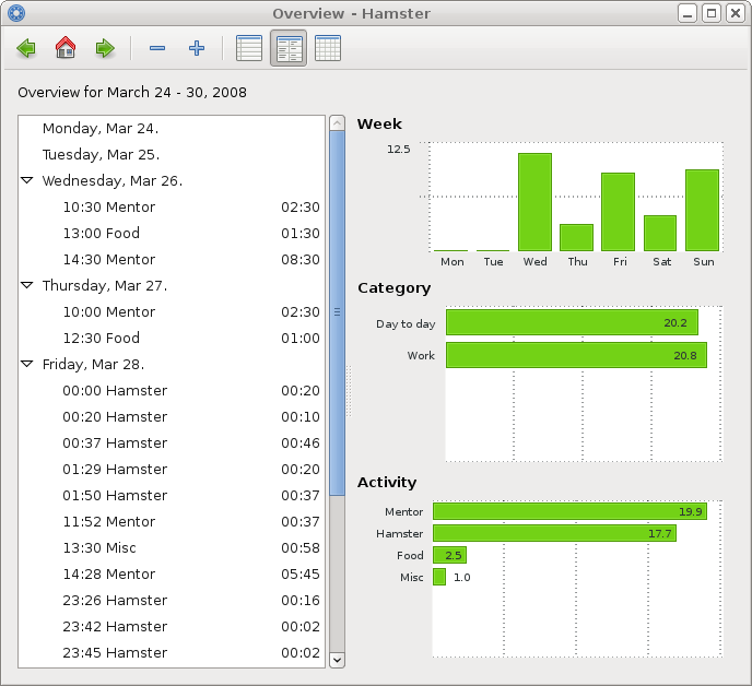
You might be interested in bits i did for project hamster - i added some simple bar charts, using Cairo. Here is how it looks, and here is the beginning of library (used in stats.py in same folder - look for "Chart"). I intend to shape it up some more, but just as much as i need for hamster. Drop me a note if i can help!
Oh, and here is an screencast (1.7MB OGG)!
~~~ TomsBaugis