Breadcrumbs on the panel and some other ideas
These images contain some design ideas for GNOME Shell.
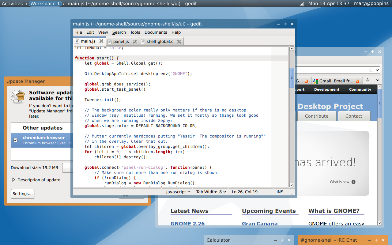
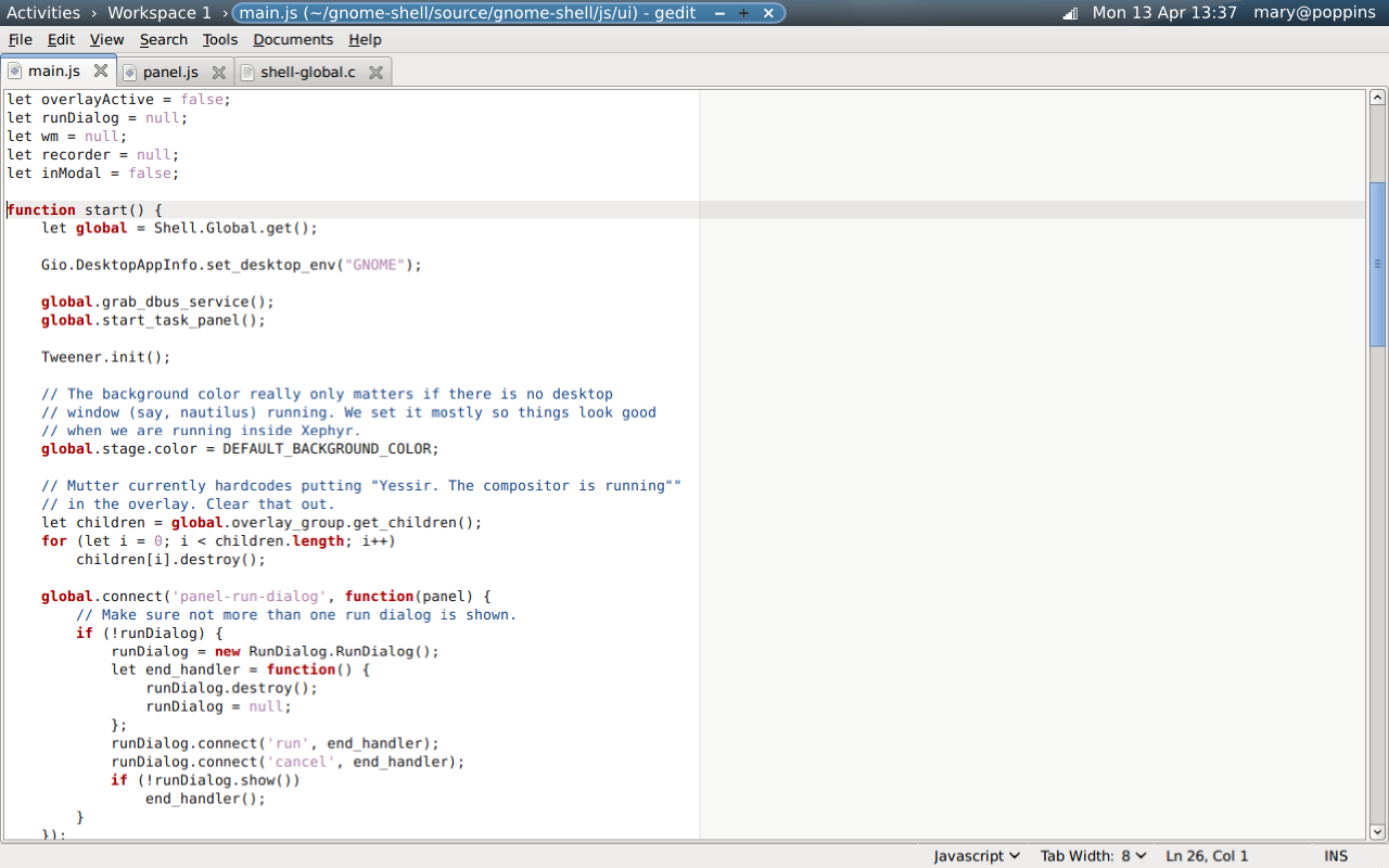
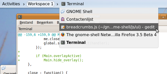
Breadcrumb navigation is used at the panel. This gives a clear hierarchy between the Activities overview, a workspace and the currently focused window. All items are activatable: clicking Activities shows the overlay, clicking the workspace name shows the ‘normal’ workspace view and clicking the window title maximizes the window. The window title breadcrumb could also be used for opening a drop-down list for selecting other windows.
 To try this, you can use an experimental Git branch with a partial implementation. See Re: Breadcrumbs in the panel for an explanation about how to set this up. It currently looks like this:
Maximized windows get as much screen space as possible. The breadcrumb on the panel acts as the titlebar, and there are no distractions on the screen.
Window shading (‘rolling up windows’) takes over the role of minimization. By default, shaded windows are placed at the bottom of the screen, but they can be moved. If the lowermost row is full, a new row is stacked on top of it.
Windows that request attention get another frame color (orange here). This also goes for shaded windows that request attention.
The system name is show at the top right, instead of the user’s full name. It’s useless to remind me of my full name all the time, but I might want to know what pc or (GNOME Online) server I’m logged in to.
Other changes were not really thought about. For example, window icons are left out in the mockups but it makes sense to have them in both the title bars and the panel.
These and other, related ideas are discussed on the mailing list in the Breadcrumbs in the panel thread.


