Visual Style
This page primarily concerns the visual style of GNOME applications. The focus is on the stock visual style defined as part of Adwaita. However, we're taking this opportunity to look at the visual style of the apps as a whole, including the use of icons, illustrations, color and typography.
Visual style is an important means through which the identity of the product is communicated. It is therefore important to consider product identity and value proposition.
Goals
- Be attractive.
- Provide visual interest when it's needed. Get out of the way when it isn't.
- Communicate product identity (see discussion below):
- Competence: secure, reliable, high-quality
- Up-to-date-ness: contemporary, innovative
- Familiarity: accessibility, ease of comprehension, ease of use
- Be consistent and coherent, including:
- Icons
- Wallpaper
- UI visual styling
- Typography
- Illustrations and larger placeholder graphics
- Tone and style of text
- Functional goals:
- It should be clear when controls are interactive versus insensitive
- Text should be legible
- Indicate which window is focused
- Dark and light versions of the theme, to complement different types of content
- Possible secondary goals:
- Help to communicate which window belongs to each application.
- Allow third party applications to communicate brand identity.
Relevant Art
Material Design is the main design system. Layout is based on traditional graphic design and typograhic principles (grids, geometric alignment, whitespace). It's generally flat.
App identity and branding is promoted through "theming". This allows colours, fonts and other visual elements to be adjusted to give each app a distinct look.
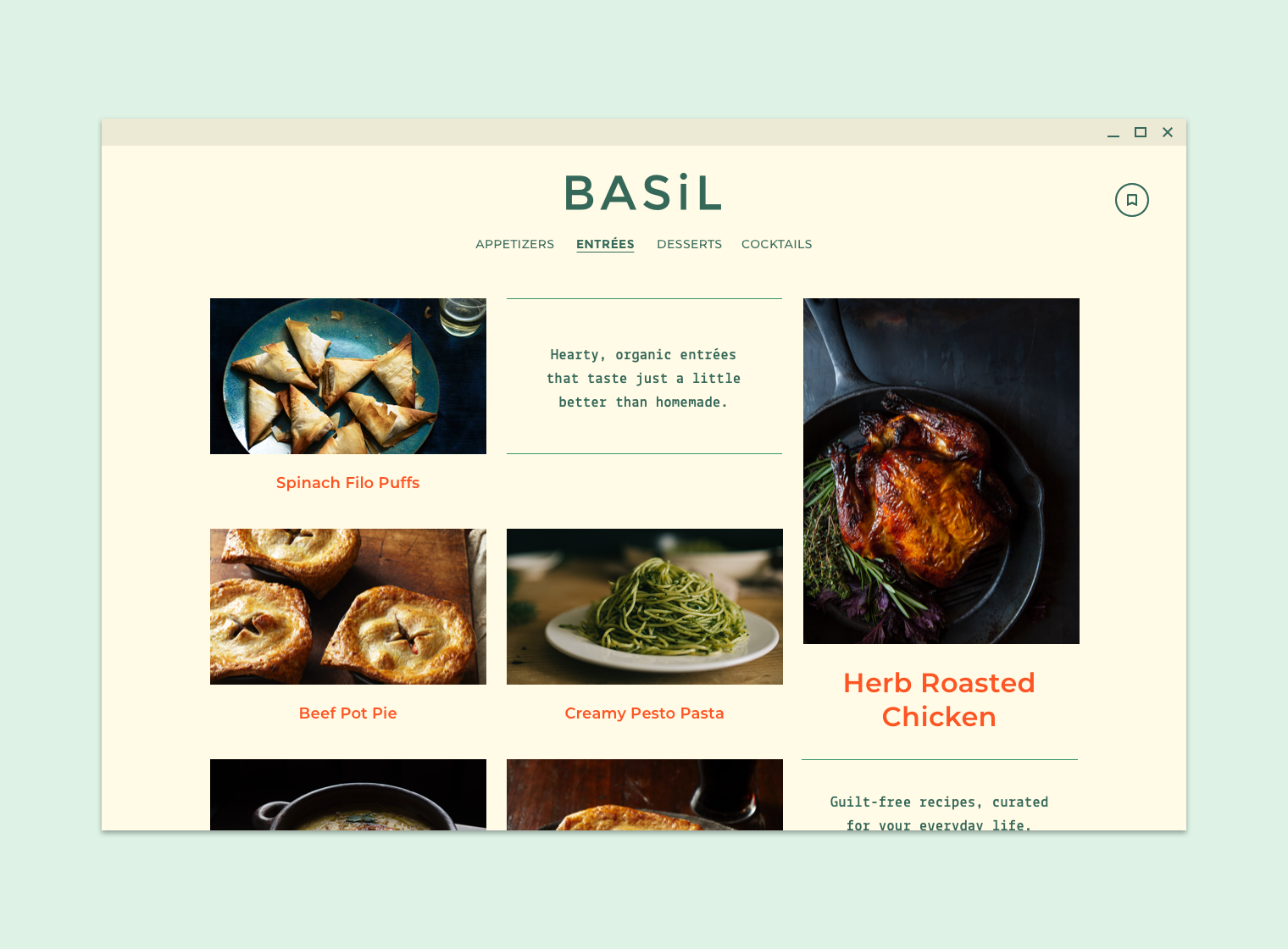
Stock Google apps are moving away from strong colour used for decoration. One example is the latest iteration of Google Play on Android:

Notable use of whitespace, strong app-specific colour used for controls rather than decoration. More background on this here.
Windows
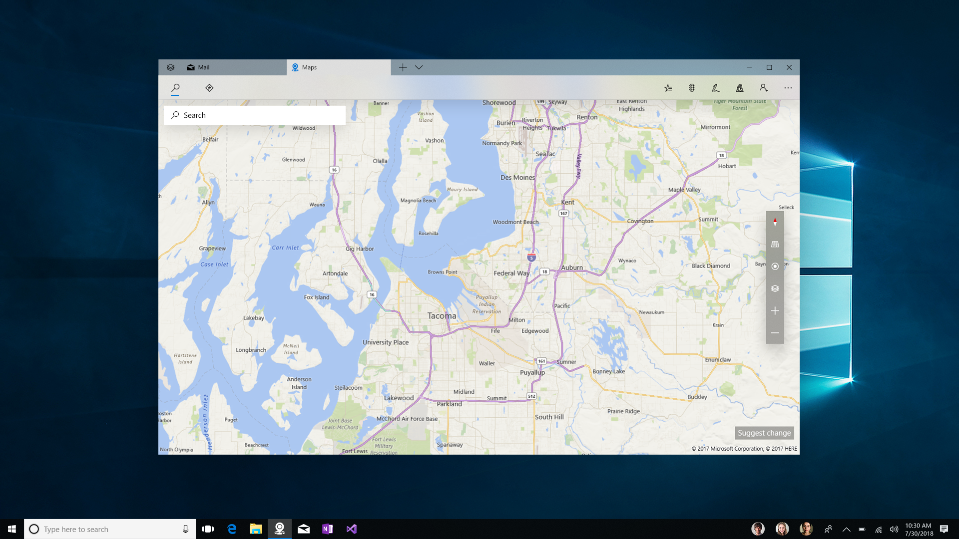
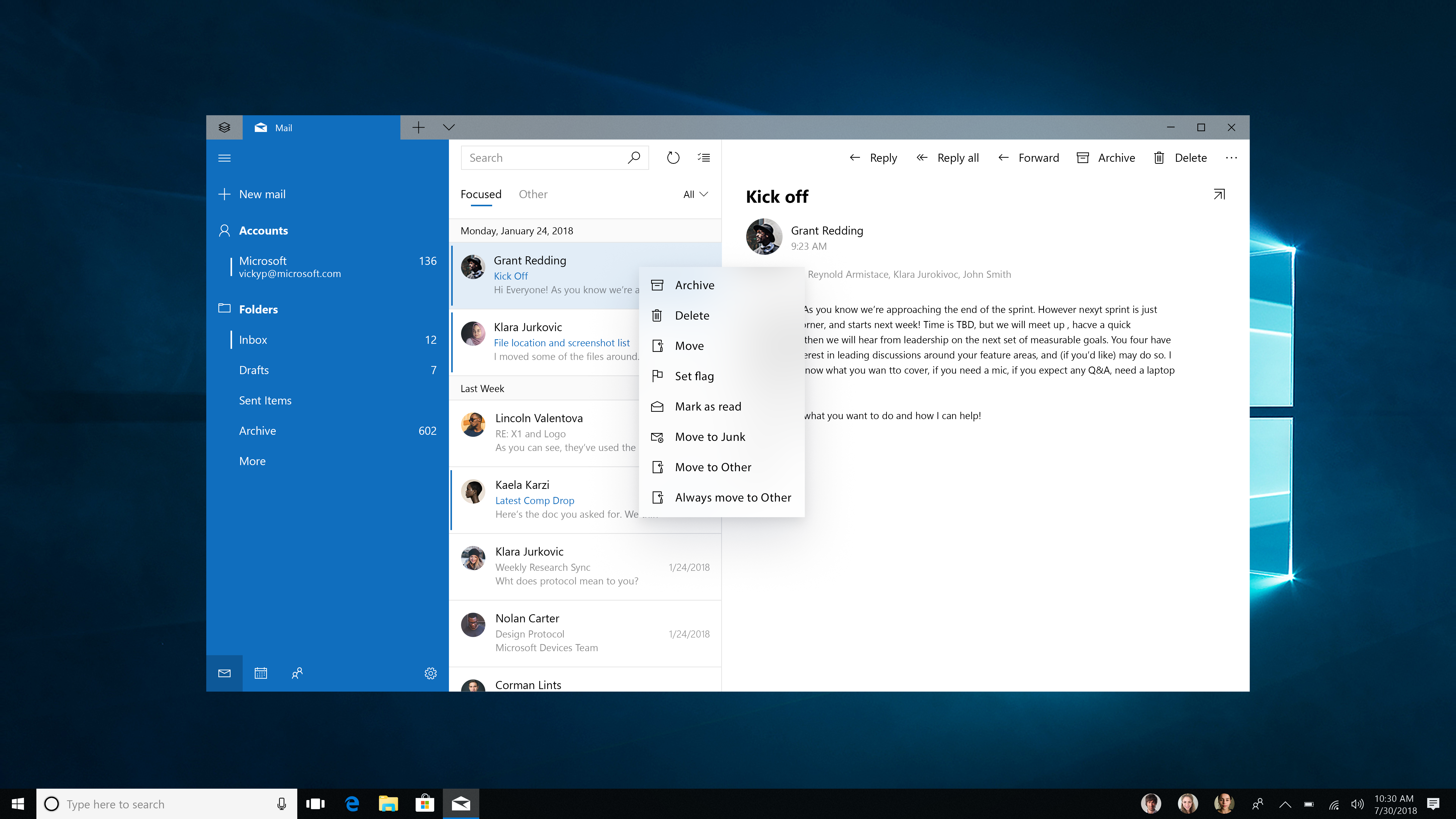
Fluent design is the design system being promoted and used by Microsoft. It emphasises:
- Responsiveness and adaptability to different form factors
- UI depth, using parallax effect
- Motion and animation, to aid transitions
- Imitating real-world materials, particularly blurred, textured semi-transparency
Surfaces are generally flat. Layouts are open with plenty of whitespace.
iOS
iOS 12:
/cdn.vox-cdn.com/uploads/chorus_image/image/59951171/Screen_Shot_2018_06_04_at_4.08.20_PM.0.png)

Most of the app UI is clean, flat and white - very classic design. Bright color is primarily used as an accent for controls.
System UI is a bit different and makes use of gradients and transparencies which mimic physical materials, in particular frosted glass.
Mac
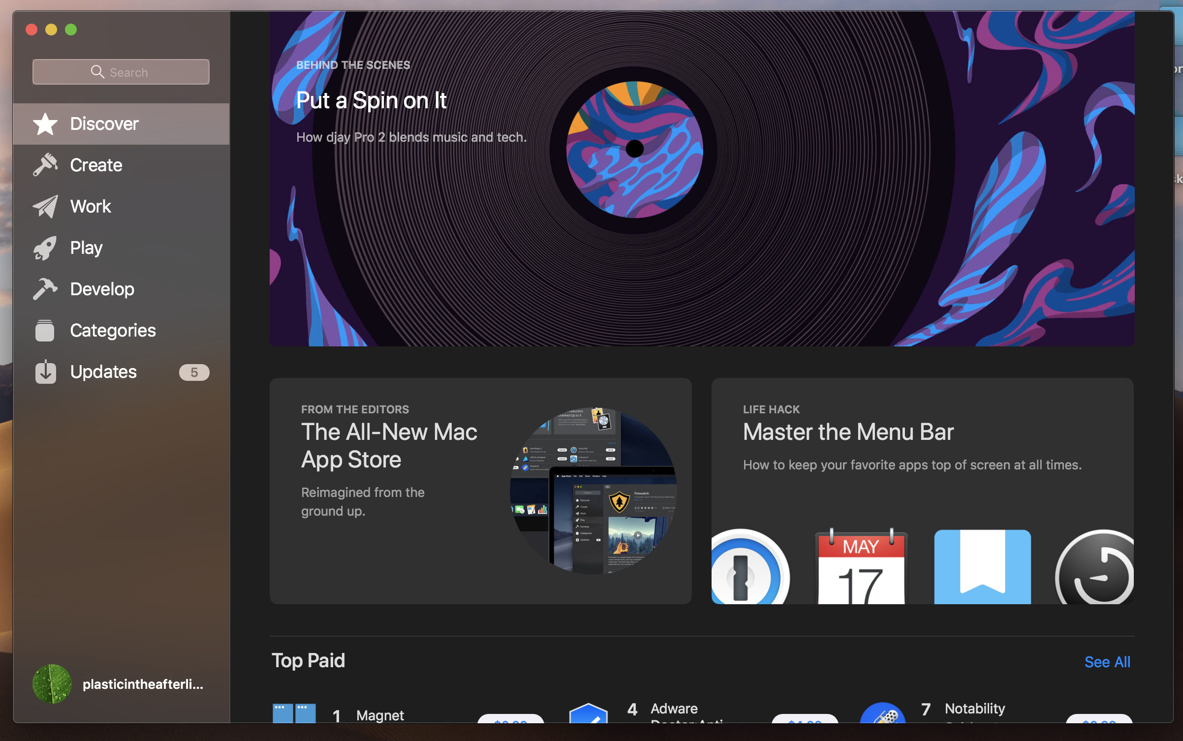
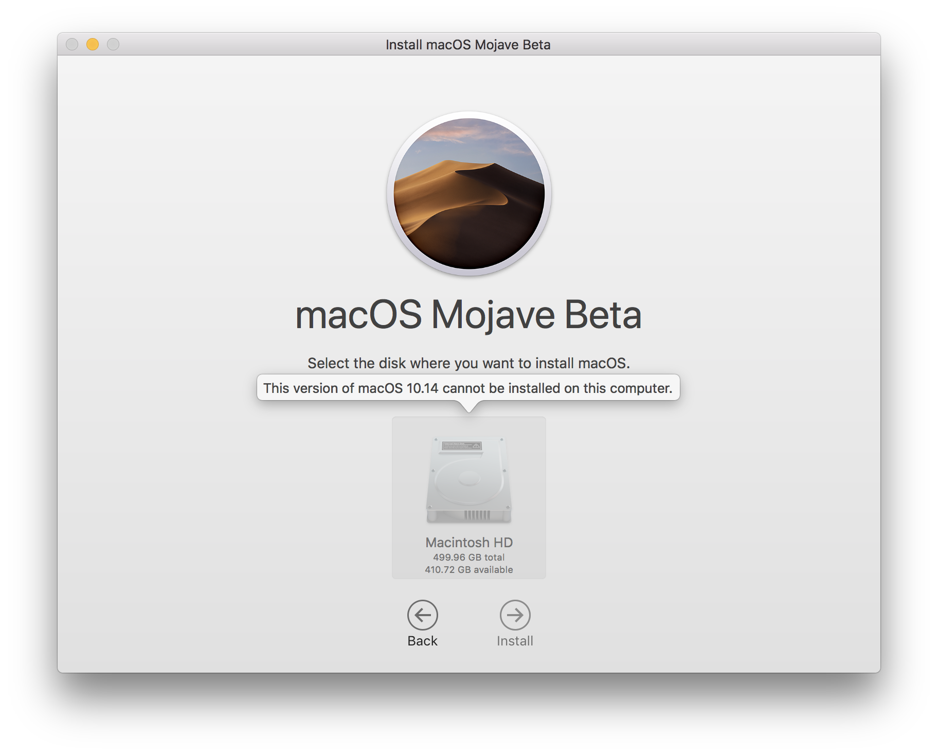
It's flat-ish: there's some depth, but it's used sparingly. Also, the flat areas often have a subtle gradient. The overall look communicates premium quality and classic design. It's like Dieter Rams and a Lexus had a baby.
Balance between lots of whitespace and neutral iconography on the one hand, and strong accent colours and artwork on the other.
Discussion
Initial research and notes
Visual look and feel helps to communicate the product's identity. This is in turn influenced by product's value proposition.
My feeling right now is that GNOME's main sell is:
- Reliability: your laptop won't break like Windows. You won't get viruses. It's stable.
- Low cost: you can run it on PC hardware and you'll have a good experience.
- UX quality: it's easy to use, it Just Works.
There are three main brand personality traits that these translate to:
- Competent: secure, efficient, reliable
- Up-to-date: contemporary, innovative
- Honest: sincere, thoughtful, caring, cheerful
(Taken from Aaker, Building Strong Brands)
I think the dilemma we have is how to position the product in terms of:
- Cheerfulness and lightheartedness: this could clash with notions of efficiency, competence, innovation (which are all serious)
- How edgy/daring/off-beat to make it: this could go well with notions of innovation, but less so reliability. It might not work for some of our target audience.
Product positioning
When communicating a product's value proposition, it is common to make a nod to existing products. This helps users to position where they think the product is coming from.
Concluding thoughts
Part of the job of our visual identity is to communicate product identity. Here there maybe three aspects to try and integrate:
- Competence: secure, reliable, high-quality [1]
- Up-to-date-ness: contemporary, innovative [2]
- Familiarity: accessibility, ease of comprehension, ease of use [3]
[1] This is intended to reflect some of the core strengths of the Linux desktop (reliability of installation and updates, lack of security issues). [2] This basically falls out of GNOME being a software product: software is expected to be up-to-date technologically, which then has to be communicated through visuals and style. [3] This reflects GNOME's core strength in the area of design/usability. It also reflects how people relate to the desktop today: they generally want something familiar ("a desktop") that works.
These qualities are only a starting point - the visuals need some character that goes beyond them. One thing we do need is a certain level of richness and visual interest, particularly when it comes to illustrations.
One thing we've discussed is how much humour and light-heartedness to incorporate into the identity. I wasn't sure that there was scope for that, but now I think it could fit, other visuals allowing. One thing we ought to think about is how to contrast GNOME from the major desktop players, and light-heartedness may have a role to play here.
Design Concepts
Comments
