Tabs
Contents
We should have a consistent use of tabs throughout GNOME 3 that accommodate touch and high precision pointing devices, allow for intuitive access and control, and are elegant in appearance.
Objectives
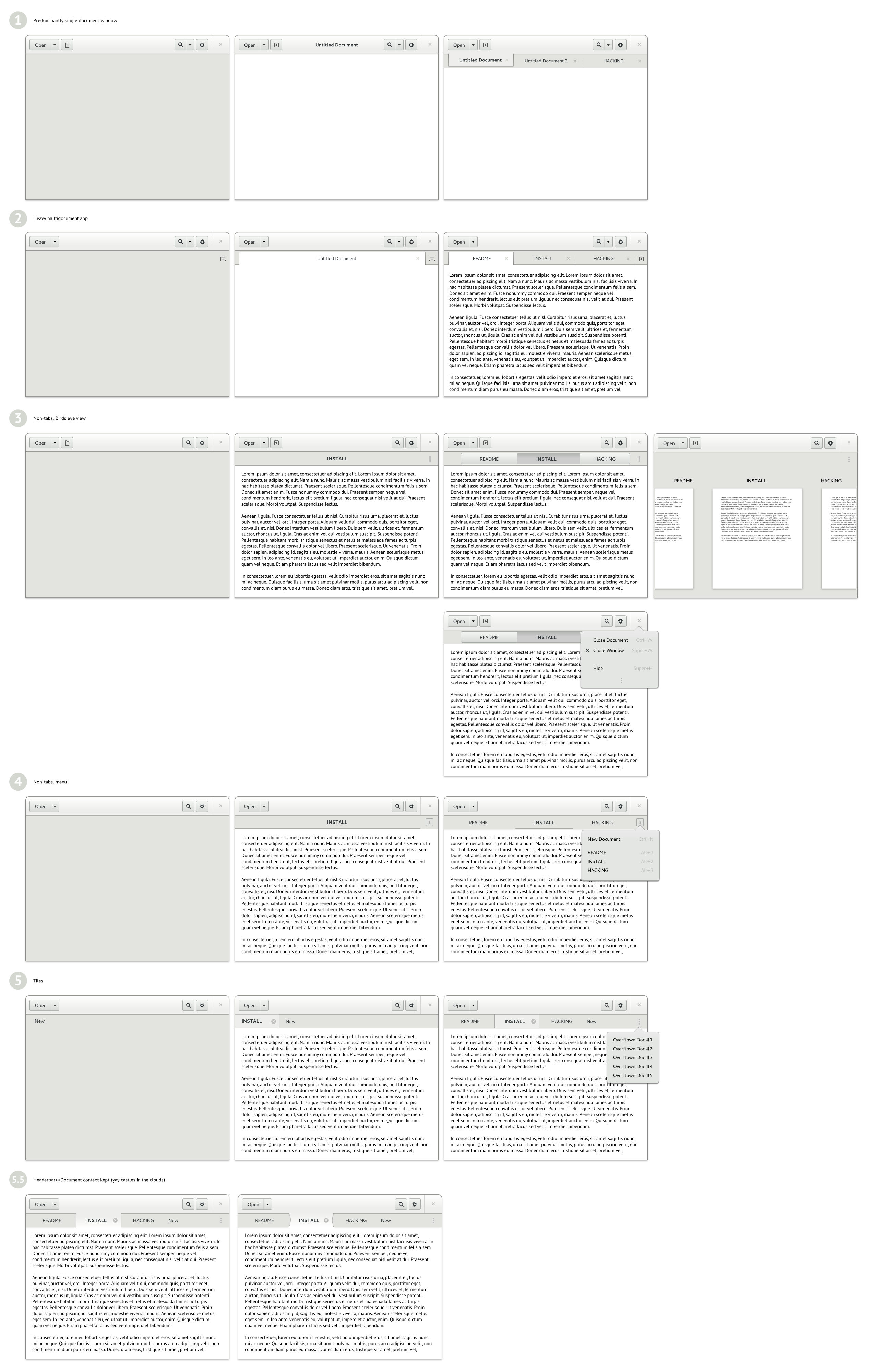
There are two somewhat distinct uses for what are commonly called tabs.
- The "fixed number of tabs" case often found in preferences dialogs
- A multiple document interface often found in browsers, editors, and terminals.
This document will focus on the second. The first may be better handled as a view switcher.
- Allow for both text, icon, and icon+text labels.
- Optional close button on the active tab.
- Animated add, remove, and reorder.
- Ability to move tabs (either by dragging horizontally or with keyboard shortcuts).
- Tabs should be able to act as drop targets.
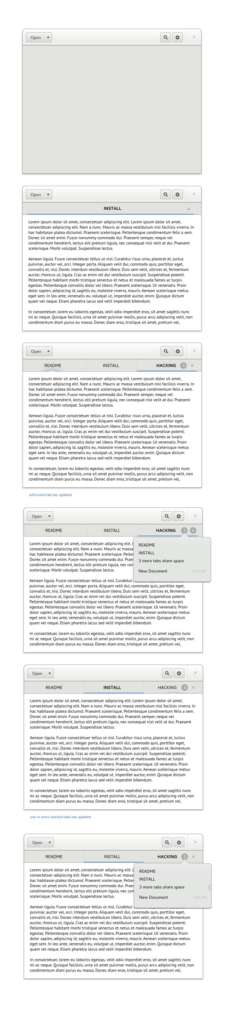
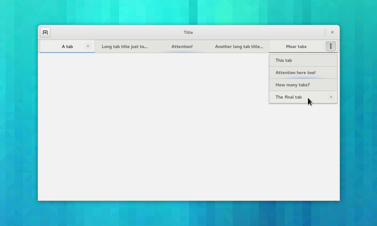
- Provide a way to indicate a non-active tab has activity.
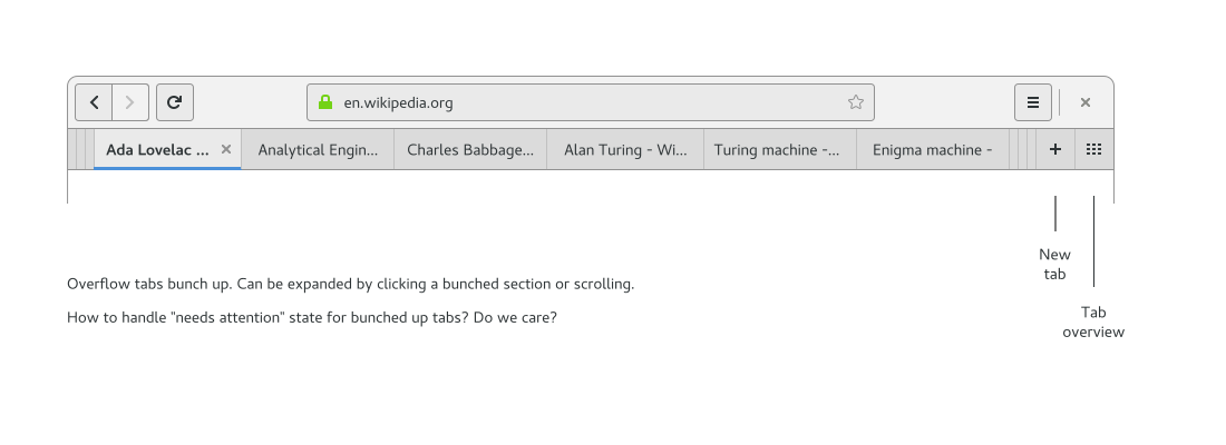
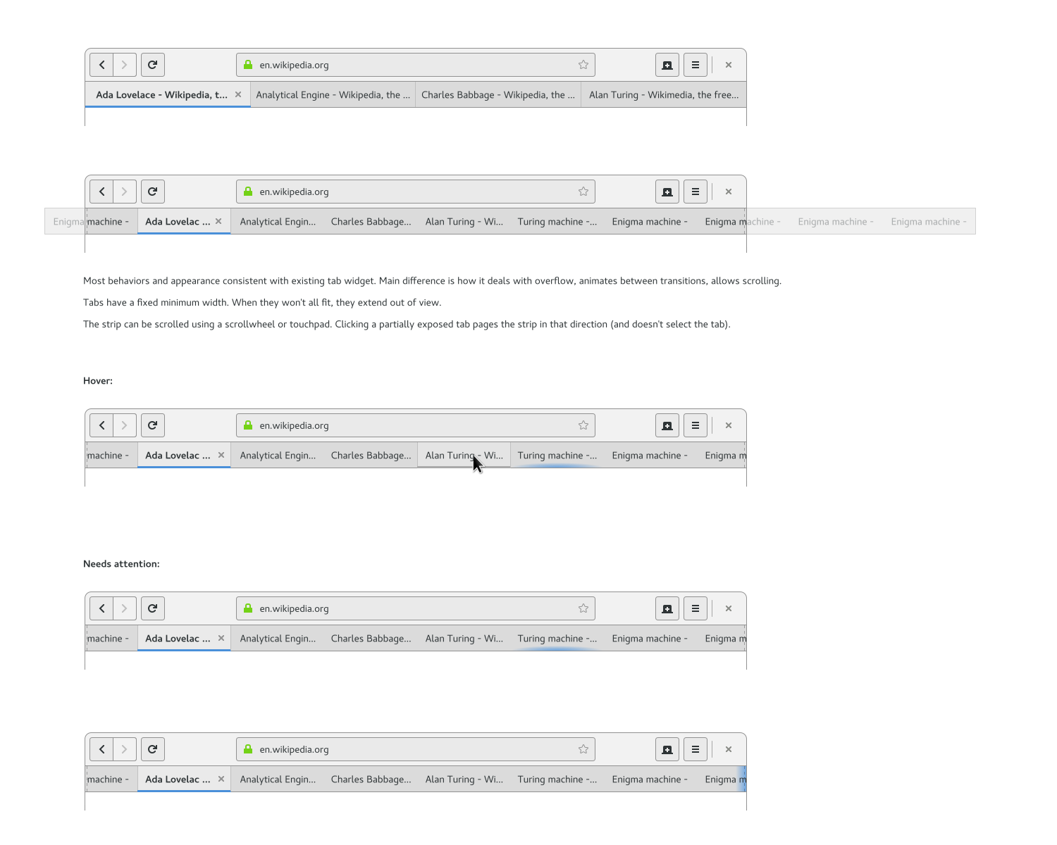
- Handle overflow where there are more tabs than available space. Requirements here:
- Not too much work to access overflowed tabs.
- Fast browsing through all tabs (scrolling is good for this).
- Needs a way to indicate when non-visible tabs have activity.
- Compatible with pointer and touch interaction.
Nice to have:
- Always display the active tab.
- Always keep the tab sequence intact (don't reorder tabs according to what's selected).
- After tabs are deleted, delay resizing remaining tabs until after the pointer has moved. This means that close buttons fall below the pointer, making it easy to close multiple tabs.
Questionable requirements:
- New tab button in the bar.
- Provide a way to get a richer view of all open tabs (such as a tab overview).
- Ability to split out a tab (either by dragging vertically or with a keyboard shortcut).
Relevant Art
iOS 5

Safari 6
Tab navigation to use with touch interfaces

Safari 8
Tab overview:

Overflow:

Firefox 13


Discussion
Prototypes and Design Development
Older Iterations:
Motion prototypes:
https://people.gnome.org/~jimmac/adwaita/tabs-0001.webm
Web used only as a placeholder. Kept the new tab button due to the one tab<>many tabs situation
- Pushing overflown tabs causes spatial conflict (first one gets pushed away? last one?)
https://people.gnome.org/~jimmac/adwaita/tabs-0002.webm
- Overflown tabs replace only the last tab, the order of the other tabs remains
https://people.gnome.org/~jimmac/adwaita/tabs-0003.webm
- Overflown tabs form a counter
Old concepts:
Tentative Design

Comments
it would be interesting to be able to switch between classical tabs and tree tabs, as this help user to easily follow its own navigation path tree style tab is an example of what can be done in this direction, improvement to this may include:
- easy switch between classical en tree view
switch between tree hierarchy with different criteriea (navigation path, display path, etc) -- psychoslave 2013-08-03 21:09:40
how does the overflow menu scales? It is not uncommon to have tens of tabs opened in browser among power users (and in text editors) and at least speed displaying all tabs in documents menu in gedit was wanting. -- MaciejPiechotka <<DateTime: execution failed [Bad timestamp u'2013-08-04T10:59': invalid literal for float(): 2013-08-04T10:59] (see also the log)>>
How does "modified state" change the tab content? Do we want to be consistent about that across applications? Some use a "*" to indicate modified, Firefox uses a green highlight color, etc. ChristianHergert
- I have many reservations on the proposed design, at least in its current implementation, both from a behavior and from a visual point of view
- Close buttons only shown on the current tab: I think this is wrong since one of the most frequent operations I do both in a browser and in gedit is to open a bunch of tabs to find something and then close many of them *except* the current one
- Always expanding: I would definitely prefer a well sized natural size with the ability to shrink a bit when there are many tabs: I find having things side by side at natural spacing much more natural than widely spaced huge tabs. Beside it ensures that when closing tabs I can just click on the close button and the next tab ends up with the close exactly under my mouse making it more efficient
From the visual point of view I understand that this is subjective, but I by far prefer the sober square tabs proposed in the mockups than the implementation where the current tab is only identified by the underlining. The new look is inspiered by android, but there are many important differences, for instance android always uses black chrome making the underline much more evident, while in gtk has to work well with light chrome too. Beside the indicator becomes even less noticeable when combined with other patterns we use: for instance when there is an info bar open which also is blue. -- PaoloBorelli
See Also
http://support.google.com/chrome/bin/answer.py?hl=en&answer=95451
Close buttons: https://bugzilla.gnome.org/show_bug.cgi?id=705487
New information: https://bugzilla.gnome.org/show_bug.cgi?id=705488
A new data set from Firefox reveals our browsing habits (information on how many tabs people tend to have open)