System Status Area
Contents
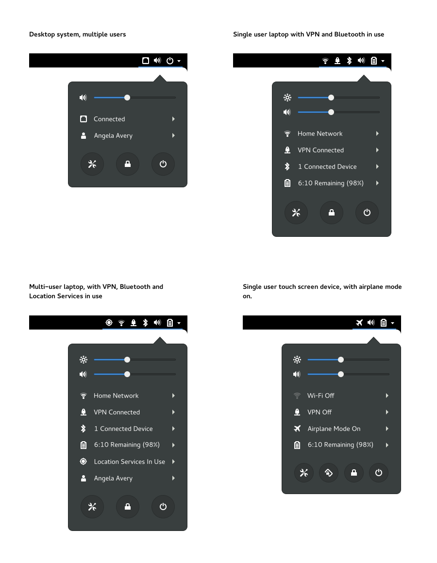
The system status area is located on the right hand side of the top bar. It provides feedback on the state of the system. The area also has a menu which gives access to commonly used actions in relation to system status.
The System Status Area is not an area that is variously called the Notification Area or System Tray and should not be used by applications (foreground or background). This distinction is necessary to ensure the entire top of the screen is designed properly, system owned and coherent, able to be modified or extended, scale well to smaller form-factors, and not become a dumping ground or high-profile branding opportunity.
Goals
- Use a style that is consistent with the text and menus present on the top panel.
- Don't distract - indicators should use colors in a considered and measured way. Icons and indicators must not change rapidly or abruptly (not more than once a second).
- Offer limited, and common functionality.
- Don't be a primary interaction point - any action that is available through a status icon should also be accessible from elsewhere in the design. For example, network access must also be able to be configured through the system preferences / control-center.
Each aspect of system status should map to part of the Settings application.
Non-Goals
- Steer clear of overt application integration, in order to stay focused on system level status. Therefore, don't include controls for music players or notifications.
- System configuration/preferences (rather than status).
Relevant Art
Android

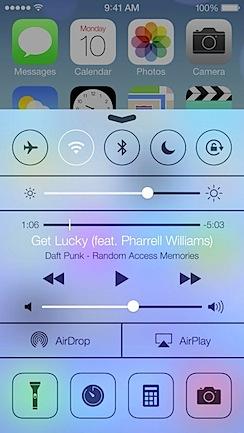
iOS

Windows 10
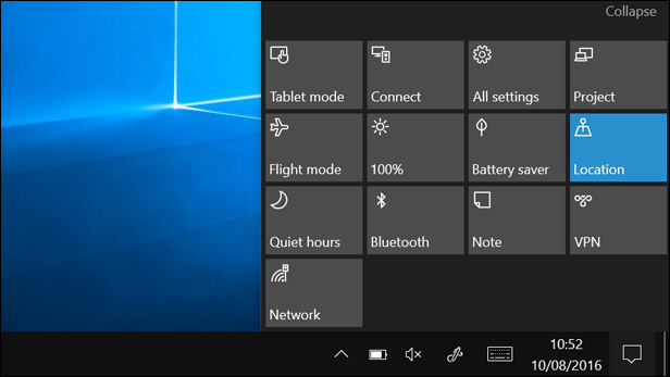
Bottom of the action center has a grid of system status items:

Each item performs an action on click. Some of them display more options (example: network allows connecting to a wifi network), but most toggle a setting or perform an action (project, connect, hotspot, flight mode).
Chrome OS

Guidelines

Top Bar Icons
Icons are listed in order of position in the top bar.
Item |
When to display |
Screen Recording |
When screen recording is taking place |
Screen Sharing |
When the screen is being shared |
Location |
When an app is using location services |
Wired |
When wired network in use [1] |
Wi-Fi |
When wi-fi is in use [1] |
Mobile broadband |
When mobile broadband is in use [1] |
USB tether |
When a USB tether is connected [1] |
Bluetooth tether |
When a Bluetooth tether is being used [1] |
VPN |
When a VPN is connected |
Airplane mode |
When airplane mode is on |
Bluetooth |
When bluetooth is in use |
Battery |
When a battery is present |
Volume |
When audio output is present |
Power off |
When a battery is not present |
[1] Network status icon notes:
"In use" is defined as being used by network manager as the default route (interfaces are selected using a hard-coded ranking).
- If the user attempts to use a higher ranked interface and an error occurs, we should also show the status icon for the higher ranked interface. In practical terms, this means that, if the system is using mobile broadband and wi-fi is in an error state, the wi-fi icon is also displayed.
- Network status is always displayed per interface: generic send/receive or no connection icons are never used.
Menu Items
Item |
When to display |
Label |
Notes |
Sliders |
|||
Audio |
When audio is present |
N/A |
Speaker icon turns into headphones when they are plugged in. |
Microphone |
When a microphone is in use |
N/A |
|
Brightness |
When screen brightness can be adjusted |
N/A |
|
Submenus |
|||
Wired network |
When a network cable is connected |
"Connected" |
|
Wi-Fi |
When wi-fi hardware is available |
When connected: "<network name"> |
|
Mobile Broadband |
When a mobile broadband interface is available and set up |
When connected: "<network name>" |
|
Bluetooth tethered network |
When a bluetooth device with network is set up, and bluetooth is on |
"<Device> Connected" |
If the signal strength can be ascertained, use network-cellular* for the icon; if not, use network-connected-cellular. |
USB tether |
When a USB tether is connected |
Same as Bluetooth tether, replacing the device name with "USB Tether" if a device name cannot be found. |
If the signal strength can be ascertained, use network-cellular* for the icon; if not, use network-connected-cellular. |
VPN |
When a VPN has been set up |
"VPN Connected" |
|
Bluetooth |
When paired devices are set up |
"On", "<no.> Connected Devices" |
|
Airplane Mode |
When airplane mode is on |
Always reads "Airplane Mode On" |
|
Screen Sharing |
When screen sharing is taking place |
"Screen is Being Shared" |
|
Location |
When location services are being used by an application |
"Location Services in Use" |
|
Battery |
When a battery is present |
"Fully Charged" |
|
User |
If there is more than one user or session |
The user's name |
|
Buttons |
|||
Settings |
Always |
N/A |
|
Lock Rotation |
If the screen rotation can be locked |
N/A |
|
Lock |
Always |
N/A |
|
Power Off |
Always |
N/A |
Turns into a suspend button when the alt key is held. |
Submenu Items
Each submenu should contain high-level controls for the status item. This is typically on/off, but can also include things like switching profiles for wired connections.
If there is a relevant control center settings panel, a link should be provided to it.
Lock & Login Screens
The top bar should perform the same in the lock and login screens. The content of the system status menu varies according to context, though:
- Sliders are always visible and active.
- Submenus should be visible but insensitive (expander triangles should be hidden).
- In the buttons section, only the power off button should be visible.
Old Mockups
Original GNOME Shell menu designs:
Bugs
See Also
