Top Right Notifications
A notifications design concept, featuring banners shown in the top-right screen corner.
Notification Properties
Icon |
A symbolic icon or application icon (falls back to the latter if the former isn't provided). |
Title |
The heading for the notification. |
Body |
An optional block of text which gives extra detail about the notification. Can include multiple paragraphs. Eg. A snippet from the beginning of an email. |
Default Action |
The action that is triggered when the notification is activated. This should always switch to the notification source (typically an application). |
Actions |
The notification sender can include up to three action buttons. |
Priority |
Can be set to URGENT, HIGH, NORMAL or LOW. This setting will be supported from GNOME 3.14. |
See: https://developer.gnome.org/gio/stable/gio-GNotification.html
Default actions:
- The notification's default action is activated by clicking on the body of the notification (whether it is a banner or in the Message Tray. As well as performing the default action, this also dismisses the notification.
Notification transience:
- In the previous version of the notifications design, some system notifications could be marked as transient. These notifications are displayed as a banner, but would not be added to the Message Tray. For 3.14, it would be good to try to do without this (mostly in order to reduce complexity and increase consistency). Instead of using a transient flag, notifications that are of limited long-lasting interest to users can be removed by the notification sender after a short time period.
Chat notifications are unique:
- They are the only notifications to include inline reply.
- In banner mode they can present the standard two lines of body text - in this case, the two most recent lines of conversation. Additional, non-standard, formatting can be used here.
- When expanded in the Message Tray, up to 6 lines of conversation can be displayed.
Urgent system notifications include:
- Low disk space
- Critical power
- Device hotplug
Notification update & removal:
- Notifications can be updated by the source application.
- A notification can be removed by the sender if it is no longer relevant. For example, a notification for low power should be removed if the device is plugged in, or a notification about emails can be removed and replaced by a new one.
Banners
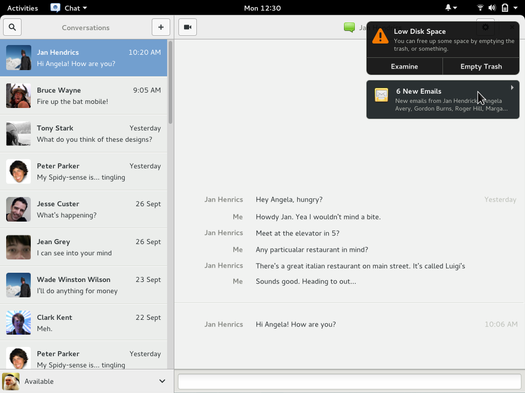
Banner examples:
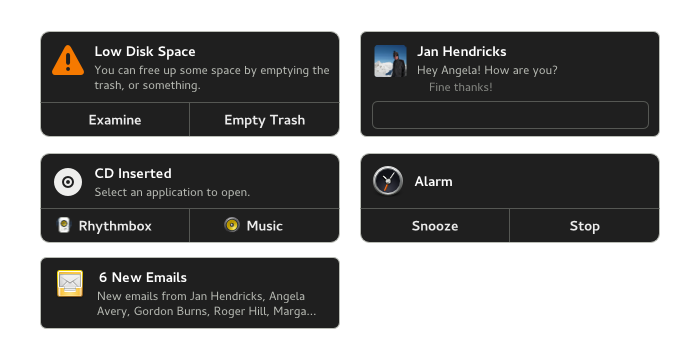
Banner appearance and position:
- Notification banners are shown overlaid on the top right.
- Each banner can include up to two lines of body text and up to three actions. Using any notification action dismisses the notification.
- Banners have a hover state to indicate that they are interactive (pressing the banner body triggers the notification default action).
- A hide button is displayed on pointer hover. Clicking it hides the banner but does not dismiss it.
- Banners appear beneath system menus (such as system status, input methods and accessibility). They are displayed as normal in the overview.
Stacking and queuing:
- If notifications arrive while a banner is already being displayed, it is stacked below.
- Queuing - if there are more notifications present than can be displayed on screen at once, they are queued in the background. As banners time out and are hidden, subsequent notifications are added to the bottom of the stack.
- Each application can only have five notifications in the system (ie. displayed in the Message Tray, visible as a banner, or queued) at any one time.
Notification priorities:
- Normal priority notifications hide after 4 seconds. Important notifications hide after 8 seconds. Urgent notifications are permanently displayed at the top of the message stack.
- Low priority notifications are added to the Message Tray without being displayed as a banner.
Hot plug notifications:
- Default action is to open the Removable Media section of the Details settings.
- Can list up to three applications.
- Buttons include application icons.
- Hot plug notifications have an urgent priority.
Message Tray
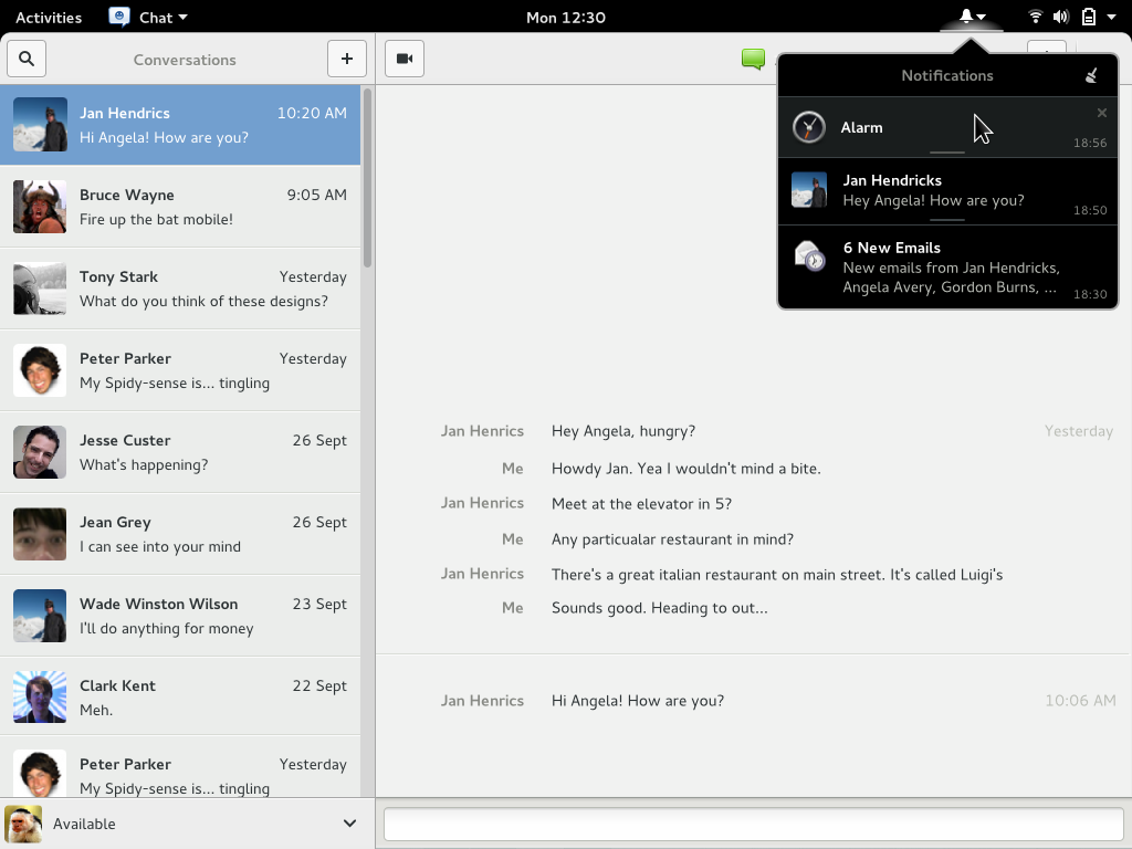
- The Message Tray is displayed as a menu, next to the system menu. It lists notifications in time/date order.
- Notifications are added to the list as soon as they arrive - ie. notifications that are displayed as a banner, or are in the queue waiting to be displayed as a banner, are implicitly added to the Message Tray - it is a representation of every notification in the system.
- Notifications can show up to two lines of body text. If more body text or actions are provided, the notification can be expanded using the grip on the bottom edge (either by clicking it or dragging down on the handle/notification body).
- Banners are not displayed when the Message Tray is open. Instead, the notification is just shown in the notification list.
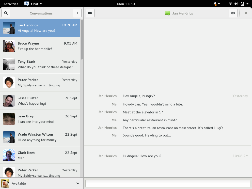
The Message Tray icon in the top bar changes appearance when there are important messages in the tray:
Status Icons
![]()
- Status icons are presented in a drawer in the bottom-left screen corner. This is only present when status icons are present.
- The drawer is permanently displayed on top of window content when it is extended (it is not visible on top of full screen windows though).
- The drawer can be retracted using the left arrow button.
- If the drawer is retracted, it partially expands to reveal the right arrow button when the pointer is in the bottom-left screen corner. Pressing the right arrow button extends the drawer.
Removable Devices
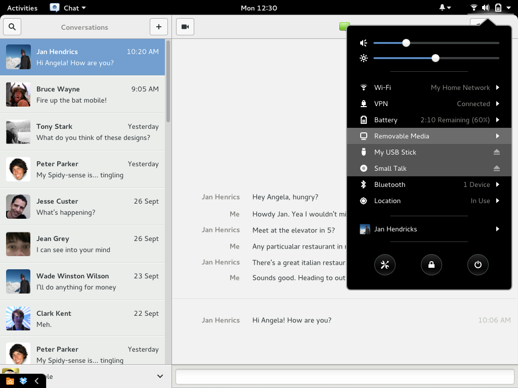
- Removable media are displayed in the system menu.
- Selecting a device opens it using the default application.
- There's also an eject button.
Calendar & System Menu
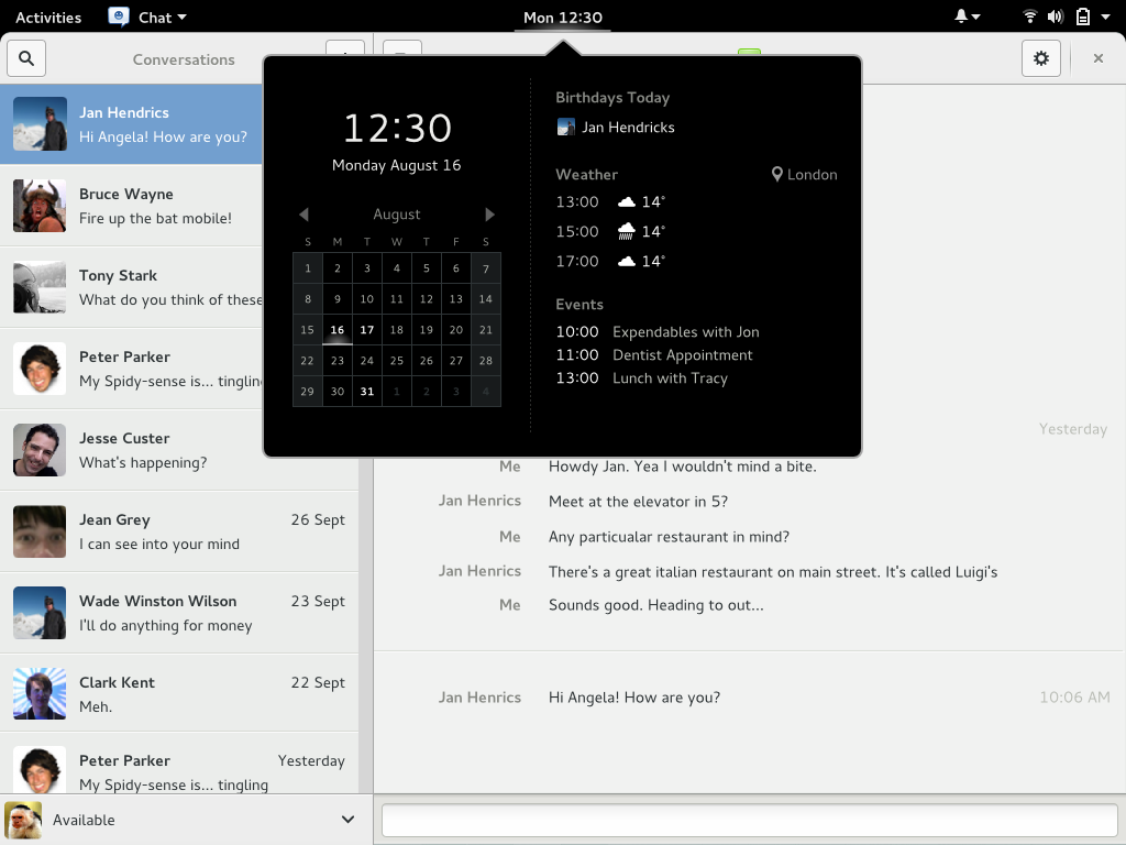
Birthdays and weather are displayed in the calendar drop down:
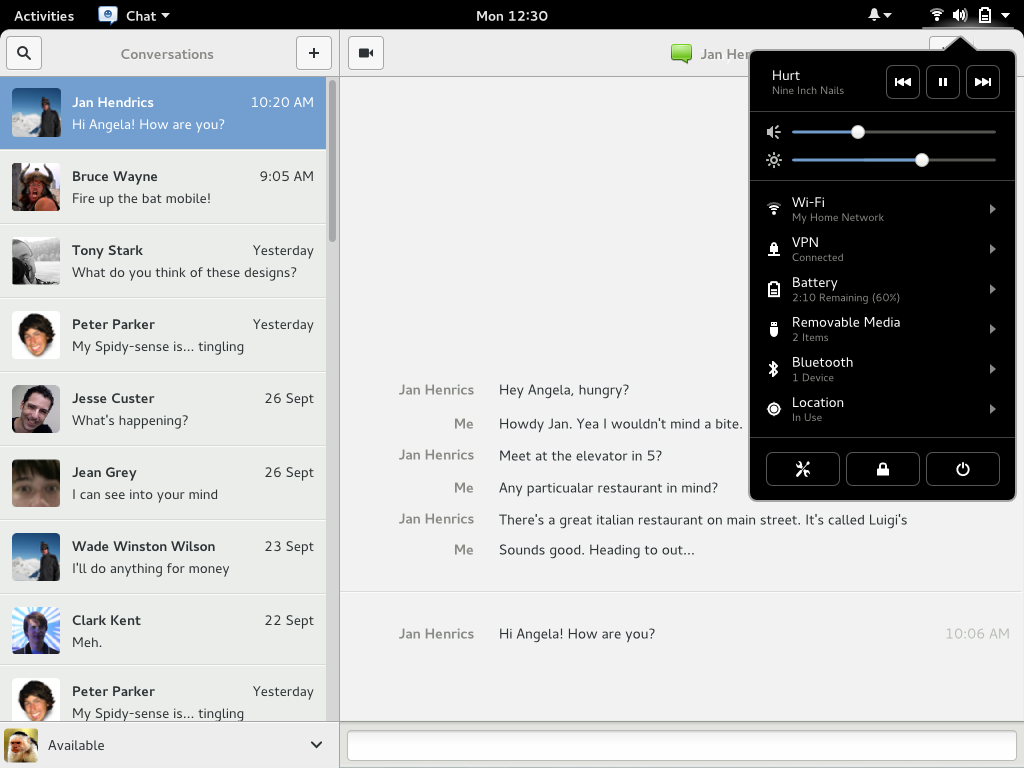
Music controls are shown in the system menu, when music is playing:
Fullscreen
Only urgent banners are displayed while a fullscreen window is focused.
Lock Screen
TO DO.
Comments
General remarks:
- banners seem more handy in a popup than in the top bar (easier to read, action buttons already available without extra step), but I miss the action buttons sticking to the edge of the screen
- good to see an explicit and visible visual indicator
- I suppose sometimes the user will click on the icon just to see if she missed something, without actually dealing with any notification. Probably a counter would be welcolme too, so that she could know just by reading the number.
- good to see notifications icon far away from the calendar. However I'm not sure if it should be closer to the system status than to the app menu.
- the system menu is indeed the best place for removable devices, to keep everything plugged to the computer in a single place
Music stuff:
- the "cd inserted" notification is particularly neat
- having the music player control under one menu and the sound level under another feels weird. The fact you can't dismiss the music player control in the notifications menu feels weird too.
- it feels like the music player deserves its own icon in the top bar, to remind if its playing or in pause
On small screens, doesn't it make a lot of icons in the top bar, when accessibility and language icons are displayed ? To save some space, what about the following ?
- grouping the bell with the status icons (using a vertical bar as firefox does for dealing with bookmarks)
- adding a view switcher at the top of the system menu to switch between system settings and notifications
- activation the appropriate view depending on which icon is actually touched
- keeping the round buttons visible on both views
-- MathieuJourdan 2014-07-04 20:43:40
"The drawer is permanently displayed on top of window content when it is extended (it is not visible on top of full screen windows though)." This looks like it has significant potential for annoyance.
-- MichaelCatanzaro 2014-07-08 20:11:00
- Device hotplug has notifications that require manual dismissal already, yes? I find it very distracting and annoying to focus on getting rid of a notification every time I plug in a SD card (which I leave in my computer all the time) or my phone to charge. Furthermore, if urgent notifications are displayed over fullscreen windows, why would I care to see that I plugged in a usb stick, or my phone, if I'm watching a movie or playing games? I strongly disagree that hotplug notifications should be urgent.
- Why would the default actions on hotplug notifications be to open the Details settings section? That setting section is pretty useless. I'd expect the default action for a hotplug to be to open it in Files.
- It's strange to see the message tray icon next to the system status. I thought the goal of the unified system status was to reduce the number of things up there. If the icon is going to stay up there, it may be cool if the menu dynamically hides when there are no current notifications.
- Relying on hover to show the hide button is not feasible for users with touch screens.
I didn't expect the hide button to be a '>' icon.
- In recent versions of osx, users can slide the top right notifications to the right to dismiss them. That may be nice to have in addition to a hide button.
Do you expect users to need to dismiss notifications twice if they want to get rid of them? (Hide > System Tray > Close)
- Pressing the banner body triggers the notification default action seems dangerous to me. If I click "Alarm" does that Snooze or Stop? In this example, it's crucial that users know which they clicked because either they'll be annoyed by the alarm when it goes off in 9 minutes or they'll over sleep. Perhaps there can be a configurable option for banners to opt-in to having a default "click the notification" action. I'm tempted to suggest that clicking the banner hides the notification, but I expect clicking "Jan Hendricks" in the chat will open the chat app window?
- I'd appreciate more mockups of how you imagine chat windows look as banners and in the system tray. E.g. if banners are typed-in, do they eventually disappear or do they forever block the "X" button on any background maximized window?
- "Disconnected from VPN" should probably be an urgent notification because critical privacy violations may occur if users don't notice that their VPN is turned off.
- In the system tray, where are the default actions for the items? E.g. Why is there no text next to "Alarm"? what does the small center-aligned line do? It it clickable? draggable?
The status icon draw is really easy to miss, is not discoverable, and is not something I expected https://en.wikipedia.org/wiki/Principle_of_least_astonishment . I'm don't have any good ideas, but I don't see how users would ever know it's there.
