Design ● OS ● Apps ● Whiteboards ● GNOME Shell ● System Settings ● How to contribute
Contents
Breadcrumbs
Needs to be suitable for Files and the Open/Save File Dialog.
Goals
- Indicate directory trees.
- Allow navigating up the tree.
- Handle deep navigation paths.
- Align with manual location entry.
- Affordance for drag and drop.
- Context menus on locations.
- Appropriate for use in header bars.
Non-goals
- Indicate hierarchy, not history.
- Don't attract too much attention - aim to be a secondary navigation element.
Relevant Art
Google Drive

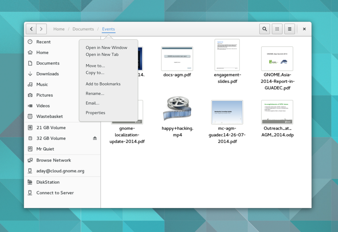
Current location acts as a menu, containing items such as New Folder, Share, Star, Move To and Rename.
Windows

Each arrow acts as a menu.
Apple App Store

Mx
OS(2f)Breadcrumbs/MxPathBar.png "MxPathBar.png")
OS(2f)Breadcrumbs/MxPathBar-Entry.png "MxPathBar-Entry.png")
Twitter Bootstrap

Nautilus "Streamlined"
OS(2f)Breadcrumbs/nautilus-streamlined.png "nautilus-streamlined.png")
OS(2f)Breadcrumbs/nautilus-streamlined-hover.png "nautilus-streamlined-hover.png")
GNOME
OS(2f)Breadcrumbs/nautilus-path-bar.png "nautilus-path-bar.png")
- Each button has a maximum width (ellipsizes in the middle once reached).
- When there isn't enough space for all buttons, the root of the path is not displayed, and pan buttons are introduced for controlling which part of the path is visible.
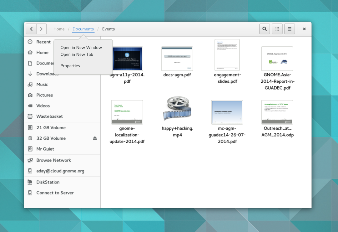
- Context menu on each location contains: Open in New Window, Open in New Tab, Properties.
The file chooser path bar is identical, except for the following:
- A "down" arrow is displayed to the left of ~/, to allow revealing locations below "Home".
- Buttons do not appear to have a maximum width.
- The location entry bar is labelled "Location:" and doesn't have a folder icon or a clear button.
- No context menus on locations.
Discussion
When the current location is in the sidebar, the breadcrumb isn't needed. Possibilities here:
- Don't show the breadcrumb when the current location is one of the predefined root locations (such as Home, Trash).
- Don't show the path below the XDG folders (so that Home would never be shown below Documents, for example).
These two possible approaches could be combined (although they wouldn't have to be). It would result in shorter paths, and a lack of duplication in the UI. At the same time, it would also mean that the breadcrumb wouldn't be a stable UI element.
Tentative Design

Previous Design

- Locations are displayed as text labels only, with no icons.
- Items below the current location are not displayed (it is not possible to navigate to sub-directories of the current location).
Primary or secondary click on the current location shows a menu
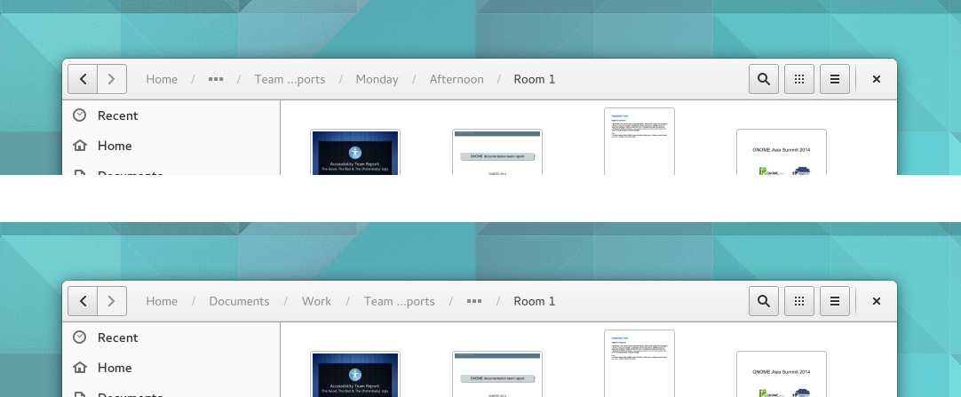
- Overflow:
- Each location entry has a maximum width - if the label is too long, it ellipsizes in the middle.
- Location entries also have a minimum width, and shrink when there isn't enough space.
Locations adjacent to the root location are hidden behind a ... icon. Pressing the ... icon displays the hidden locations to the opposite side (adjacent to the current location).
See Also
Comments and Discussion
gregknicholson: Anecdotally, I've seen confusion arise when the selected crumb is not the deepest. The user believed they were still at the deepest crumb and asked “How do I get rid of those [deepest crumbs]?”
I think the idea under "Crumb Menus" isn't good, because what is if the dictionary has more than 20 entrys? --MaxMuster
I like these ideas, but I think it is very important to show that the user can edit the path manually. The current UI suggests that the folders are merely buttons, and cannot be edited. I like the way Windows 7 handles this, if you have ever seen its file manager. --UnsolvedCypher
- I second that having editable paths is a must, even if it has to be an extra option somewhere. Perhaps either a double click or button to go to this mode? --Half-Shot
LasseSchuirmann Hi, few comments
- I really like the visualization.
- I'd prefer approach 2 for handling overflow.
- Why do we have two different menus on primary and secondary click while the secondary click menu is just a subset of the things we have on primary click? That feels highly confusing to me.
- The primary thing we want to achieve is that 1. the user gets to know where he is and 2. he is able to navigate. Thus IMO the primary action on a breadcrumb should be, as it is now, navigating there.
- How do we expose the manually edit path action to the user? Maybe a button with a pen left to it? Or can we maybe make this similar to epiphany, i.e. clicking on an empty space in the title bar makes the path textual editable?
LapoCalamandrei, hi, some notes:
- While I like the simplicity of labels and slashes, a think an arrow would work better as a separator since it could be rotated 90deg to present the path vertically, think about the overflow menu in 'approach 2' with a down pointing triangle as a separator between the lines, it would make clear it's still a path. Also it could be used when laying out the path vertically generally, like in filebrowser panes as in builder.
- Also I think a mix of both approaches could work, I mean I'd avoid "compressing" folder names in the pathbar from the root (since I think it's an important part of an overflowing path to figure out where you actualy are), but I'd still use the overflow popover which could work on click showing the hidden directories as in approach 1, clicking on a directory should make the popover content slide proposing the actions as if a folder name in the patchbar is clicked but keeping the selected dir as a title. I'll draw this asap.
- While working on the same source code trees in different places the ending part of a both paths are the really same thing, so making assumptions of what to hide is pretty difficult, hence we could allow dragging the '●●●' button around revealing different bits of the path.
- I think special folders should be presented as on the sidebar, so 'icon folder-name', as I said while I like how clean just using just text is, I think this way is more clear and as a bonus it could allow hiding the folder-name when we run out of space.
Disclaimer: I love the GNOME's way of thinking UI and UX, so please consider the suggestion as it should be: by a concerned and advanced GNOME 3 loving user.
I personally use Ctrl+L quite a few times, not a lot, but enough to make it a must have to me (copying paths, pasting paths, writing a specific path, etc...). But I don't see any mention of a text path in the new design. I think it is still relevant in my opinion. I would even go to have a UI button to be able to switch to the text path, but that's if that was only up to me.