Snowy Designer Playground
Contents
This is a place for design idea proposals for Snowy.
Add short descriptions of your design ideas with links to the mockups or write-ups here. You can create new pages on the wiki or link to the external pages. As this page becomes longer or certain features get implemented, the items on this page might be reordered or moved to a separate archive page.
Sanderd's mockups
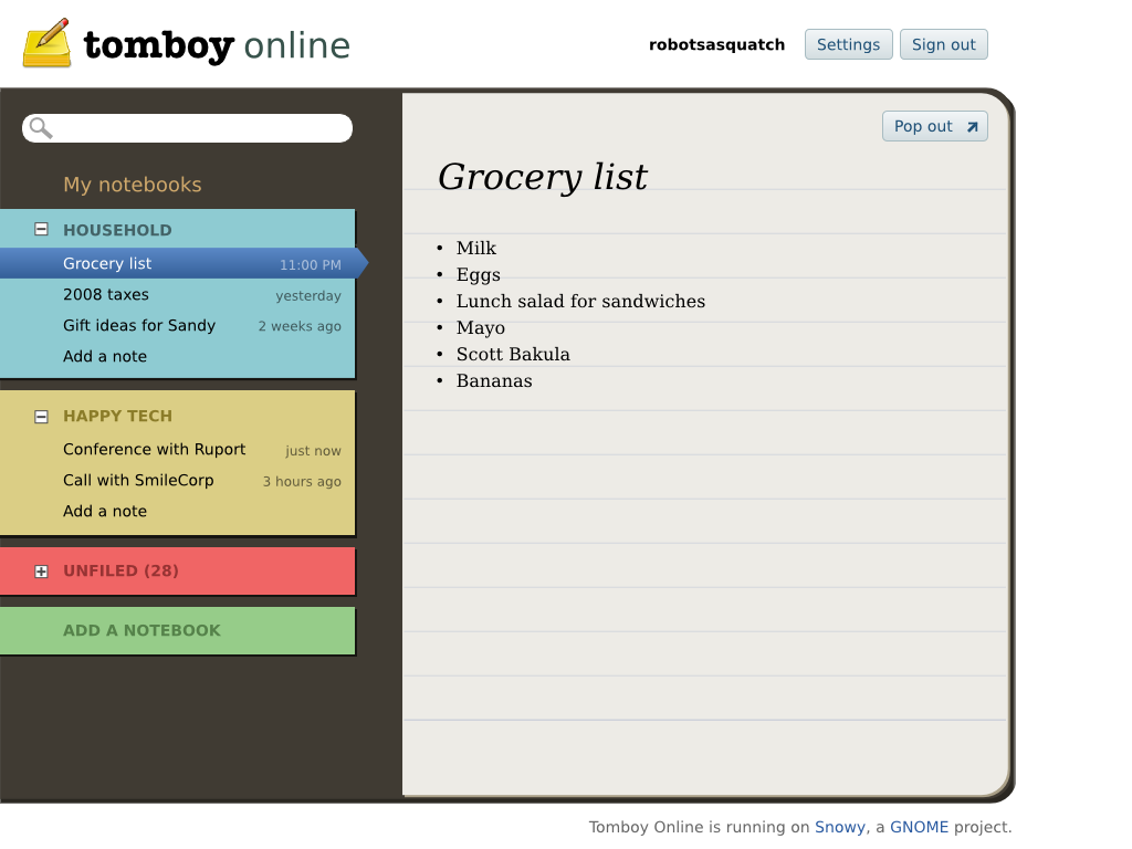
Notebook-like view
Iteration 1
- The default view somewhat resembles a real notebook.
- There is a Pop Out button to show notes in separate windows, like how Gmail Chat windows work.
- Every notebook gets a different color.
- There is no note editor in place yet.
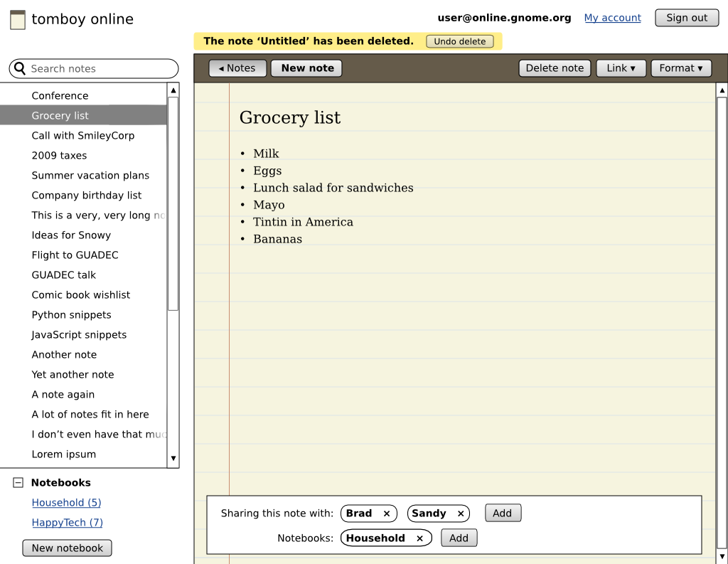
Iteration 2
- The sidebar has its own scrollbar so that all notes can be listed.
- Notebooks don't act as categories but as tags. Clicking a category name sets the search query and thus filters the displayed note list.
The sidebar can be hidden using the ‘< Notes’ button.
- The note editing UI is always visible. For links and formatting, two pulldown buttons are used.
- Note sharing and adding them to notebooks happens at the bottom.
- A yellow Undo bar for destructive actions.
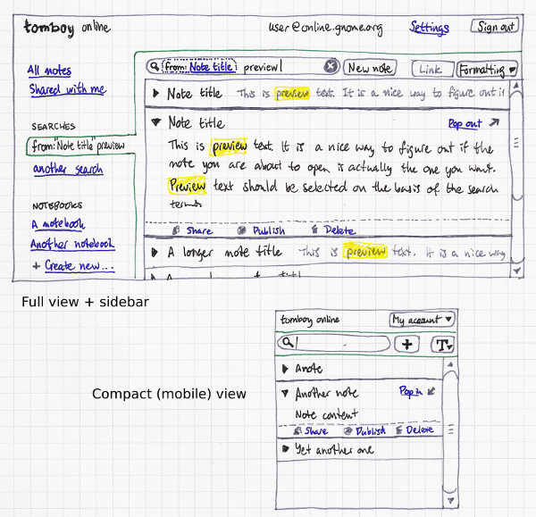
Search and compact view
Inspired by Search Window mockup for Tomboy, could use the ideas from that page.
- A compact view for small browser windows and mobile phones.
Suggestions for Nekohayo's mockups
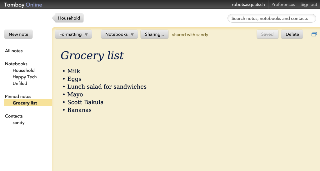
Based on the mockups below. This one should probably have some icons for the logo, the search box and dynamic items at the sidebar. Some of the suggestions are:
- Add the account name and align it with Preferences and Sign out.
- Keep the Back button distinct and outside of the note editing bar. Also label it ('Household') so that it's clear where it leads to.
- Use consistent, clear (geometric?) fonts in the interface and a more 'document-like' font in the note.
- Make the logo not distract from the content by keeping it small.
Nekohayo's mockups
Somewhat self-explanatory (or will be easier to explain "in person" at the Snowy hackfest). Based on the following principles:
- Netbook-friendly, yet usable on high res screens
- Drag and drop should work pretty much everywhere
- Use jquery/ajax a lot
- Minimize visual clutter
- Be mom-proof
- Contextual actions
- Don't show actions that make no sense in an online client (compared to Tomboy), such as the ability to delete 400 notes at once
- Reuse screen space, yet try to be non-blocking/not too modal (a difficult balance to achieve)
Warning: those mockups
Are yellow. I picked that background color totally randomly without thinking much about it

- Are not final, can be tweaked, etc.
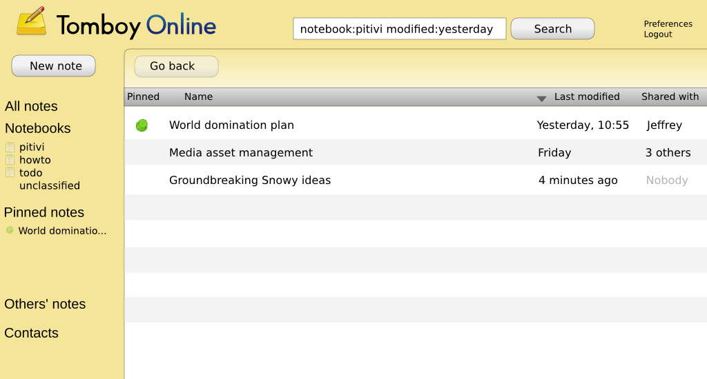
Listing "All notes":
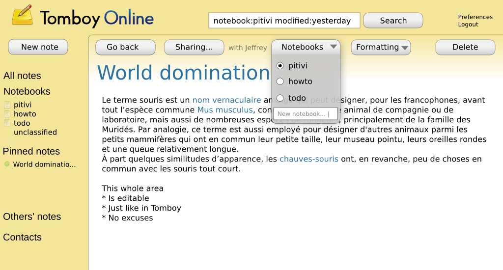
Editing a note:
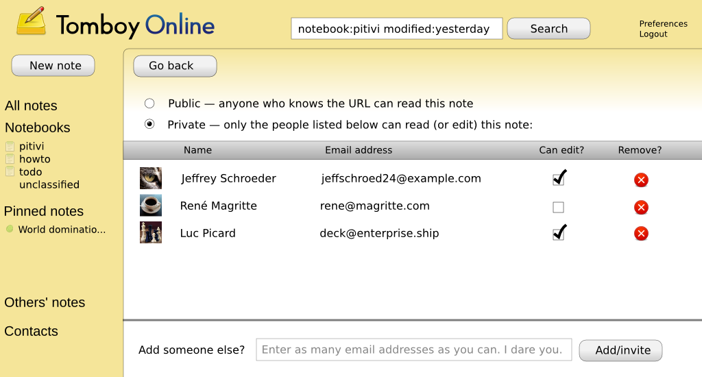
Setting a note's sharing settings:

